Put your growth on autopilot
GrowSurf is modern referral program software that helps product and marketing teams launch an in-product customer referral program in days, not weeks. Start your free trial today.
Summarize with AI
We all love getting referrals. For every referral that goes through the pipeline, we feel validated—and and relieved—in knowing that our customers love our product enough to recommend it to others.
Now for some real talk: referrals themselves are not the end goal of your referral program.
If you want your referral program to grow your customer base and boost your revenue, you need successful referrals. If your referral prospects are not signing up or buying, what’s the point?
If you’re in a similar situation, chances are your referral message needs some work.
In this post, we talk about:
Ready? Dive right in!
Here’s our definition as per our referral program glossary:
The referral message is a message sent from the referrer to their network, which could include friends, family, colleagues or other business contacts. These messages often include either a referral code or referral link. Some referrers go to great lengths to craft the perfect referral message in order to maximize the opportunity for referral rewards. These messages can be emailed, instant messaged, text or just shared in person.
As you already guessed, a referral message is not your typical recommendation. The main difference with a referral message is that you (the brand) have more control of how the recommendation is framed or communicated.
Which is great! After all, if you want to promote your referral program effectively, it helps to have some say in how your brand is perceived.
There are many ways to craft a referral message. While there's no one size fits all strategy to craft a referral message, it needs the following elements to produce successful referrals.
These elements are:
Let's go over them one by one.
Your company logo is the face of your brand. If a customer is kind enough to introduce you to someone they know, you better be prepared to show your brand’s face. And not only because it’s good manners.
Showing your company logo not only grabs their attention, but also gives them a visual or an idea to remember you by.
If done well, a logo can convey what your brand is about in a matter of seconds. It can spark curiosity. And it can serve as the foundation to build your brand story or narrative around.
92% of customers trust referrals more than other types of advertising. And you need to use that trust to your advantage if you want your referral message to be more persuasive to recipients.
You need to make sure your recipients know that what they’re reading is a referral message. If not, what’s the point?
You can do this simply by mentioning the name of the friend who sent or forwarded them the referral message. And it never hurts to put some emphasis on the word “friend.”
You've convinced your customer to send you a referral by offering an irresistible referral incentive. But what's in it for the referral prospect?
While the recommendation helps you gain credibility in the eyes of the prospect, offering a reward they can’t refuse will boost your chances of making a successful referral.
You have the referral prospect’s undivided attention. They see your company logo. They already know their friend likes using your product or service.
Time to introduce yourself.
To properly do this, answer the following questions in as few words as possible:
Your prospect knows who you are and how you can make their lives better. And thanks to a friend’s recommendation, they trust you enough to want to give your product or service a try.
Now what do they need to do next?
You can tell them to take the next step by including a call to action (CTA).
But don’t just create a wimpy CTA. Create a strong one. Remember, an effective CTA is the difference between a referral message that converts and a referral message that bombs.
Some tips to create a strong referral message CTA:
Some good CTA examples include “Show Now,” “Claim your $10 gift,” or “Shop Now.”
Knowing all the essential elements is one thing. Using these elements in a way that makes your referral message irresistible to recipients is another. You need to do the latter if you want your referral program to succeed.
Here are tips to help you create a referral message your referral prospects can’t refuse.
If you want your prospects to read your referral message, keep it short and simple. Get right to the point.
Remember, in a world where distractions are a click away, the worst thing you can do is beat around the bush. You need to get to the core of your message.
When a prospect opens the referral email to open your referral message, the first thing they want to know is this: how will this benefit me? Take too long to answer that question and they won’t hesitate to click away from your referral page.
How long (or how short) should your referral message be?
It’s often a case-to-case basis, but according to a study by Boomerang, sales emails (referral messages are sales emails, after all) between 50 and 125 words had the best response rates at above 50%.
If you feel the need to go beyond 150 words, what you can do is break the message up into short paragraphs of two to three sentences so your prospect won’t feel daunted or intimidated to read the entire thing.
I did mention that a good referral message creates a good first impression, right?
Here’s the thing: it can do even better than that.
With proper branding , a referral message can create a ripple effect, one interaction at a time.
By branding your referral message, you can present your business in a way that not only differentiates itself from others, but also connects with prospects and customers on an emotional level—which helps plant the seeds that eventually earn your customers’ loyalty and boost customer lifetime value
You can do this by creating a referral message that presents your brand consistently in tone and design. Make it so that once a prospect is done reading it, they already know what your brand is about. And more importantly, why they should care.
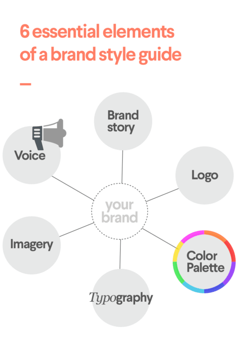
We already talked about the logo being the face of your brand. But for that logo to have a lasting impact, It has to complement other elements in your referral message, namely the color scheme, typography, imagery, as well as the tone of your message.
You can create a brand style guide to help you achieve brand consistency. 99design says a brand style guide requires the following elements:

[Source: 99designs]
When sending an email, you only have 3 seconds to grab the attention of your prospect. If you want your recipients to keep reading your referral message, you have to make those 3 seconds count.
A captivating headline might be the thing to help you pull that off.
To craft an effective headline, it should:
In his book The Copywriter’s Handbook, Robert Bly drops some wisdom on how to write an effective headline:
“When you write a headline, get attention by picking out an important customer benefit and presenting it in a clear, bold, dramatic fashion. Avoid headlines and concepts that are cute, clever, and titillating but irrelevant. They may generate some hoopla, but they do not sell.”
If you’re strapped for ideas on how to craft your referral message, seeing how others did it (or did it wrong) can give you the information and inspiration you need to get started.
So without further ado, here are referral message examples that might help spark ideas.
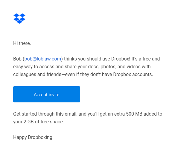
Dropbox is a company that went from 100,000 to 4,000,000 users in 15 months through referrals. There’s no question that their referral message was instrumental to their success.

So, what made it work?
First off, the iconic Dropbox logo is hard not to see, thanks in large part to the strategic use of white space around it. That logo alone tells you at a glance what Dropbox is about.
The referral message loses a point by not addressing the referral prospect by name. But the message makes up for it by making it clear to recipients who invited them.
The message didn’t waste time grabbing the referral prospect’s attention by offering the referral incentive and communicating the benefits of the service itself.
What I liked best was the placement of the CTA button. The contrasting colors not only make it hard to miss, but it also does a great job of breaking up the text, making the email copy more palatable to the reader.
Dropbox is a proponent of minimalism, which makes sense considering that getting rid of storage clutter is one of its benefits. And like any staunch minimalist, the company has managed to combine all the important elements I mentioned to great effect.
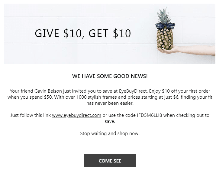
EyeBuyDirect is an optical e-commerce business known for its great prices and variety of eyewear products. The company owes its success partly to its generous double-sided referral program.

While the banner image could be more relevant to the referral prospect (sorry, the pineapple doesn’t do it for me), the referral message’s headline (“We have some good news!”) works because it creates a curiosity gap.
EyeBuyDirect continues by letting the prospect know who sent the invite. The message gets straight to the point by mentioning what’s in it for the prospect. It also communicates the eyewear company’s unique value proposition (“finding your fit has never been easier”).
Including the referral code and the website link is a nice touch because it lets recipients know the company means business. The CTA looks bland, but the use of white space does an excellent job of drawing your eye to it.
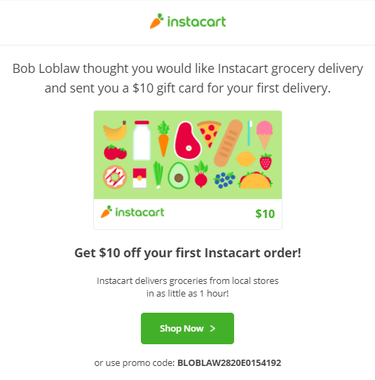
Instacart is a grocery shopping service that employs personal shoppers to do your shopping for you and have your items delivered to your home.
If you think that’s convenient, wait till you get a load of their referral program.

See that logo at the top? I bet you do (it’s hard to miss).
Instacart’s referral message cuts to the chase with a headline that tells the recipient who sent the invite and how the business can benefit them. Good going, so far.
And it gets better. Look at the image below the headline. Now THAT is visual branding at its best. The visual grab attention but in a way that aligns with and strengthens the other visual elements included in the referral message. More importantly, It not only tells you what the brand does for their clientele, but it also communicates how they do it (conveniently and efficiently).
The referral message conveys perfectly what separates them from their competitors (“Instacart delivers groceries from local stores in as little as 1 hour!”).
To top it off, the CTA "Shop NOW" just pops right out at you.
Your referral email is the most important element in your referral program. After all, it’s most likely your referral prospects’ first encounter with your brand. It’s where the rubber truly meets the road, so to speak.
True, earning a customer’s recommendation may gain you more credibility in the eyes of your prospects, but at the end of the day, it’s how you present your brand to them that will seal the deal.
By crafting an effective referral message and following referral marketing best practices, your referral program will get the boost it needs to supercharge your growth through referrals.
GrowSurf is modern referral program software that helps product and marketing teams launch an in-product customer referral program in days, not weeks. Start your free trial today.
Do you want to promote your referral program, but don't know where to start? Here are 12 ways to attract more customers and grow your business!
Writing a good referral email doesn’t have to be a nightmare. In this post, we cover the essential elements that make a referral email stand out.
While referral programs are an effective way to promote your products and services, they’re not always easy to optimize. Here are 4 powerful ways to optimize your referral program.