Do you want to know how to create a beautiful, effective referral page?
Well, you're in the right place!
A customer referral page is a dedicated landing page designed to encourage existing customers to refer new customers to your business. It serves as the central hub for promoting your referral program, explaining the benefits and rewards, and making it easy for customers to share referral links. An effective referral page can significantly boost word-of-mouth marketing and customer acquisition through trusted recommendations.
It's a win-win situation for both you and your customers: someone gets a fantastic deal while you get more business from new customers!
This blog post will teach you how to create the perfect referral page, step-by-step, with examples.
It will cover everything from what goes on the referral page to tips for promotion.
Let's get started!
What Is A Customer Referral Page?
A referral page is a landing page that directs visitors to take action by offering some type of reward or incentive, usually in the form of giving away an item for free or at a discount when they refer friends and family.
Many businesses have found that their customer referral programs are more effective when the referral pages are designed well and attract the customer with great designs and content.
As you can probably tell from the title of this post, I'm going to show you how to make a perfect referral page.
But before we jump into that, I need to mention why having an awesome customer referral program is so great! Some people might think that this is unnecessary, but in reality, it's one of the best ways to grow your customer base.
Why Should You Create a Referral Page?
There are several compelling reasons why having an effective customer referral page is crucial for businesses:
It establishes credibility and shows customers you're serious about your referral program.
It provides a single source of truth for program details, rewards, terms, and conditions.
It allows you to optimize and A/B test different messaging, visuals, and incentives to maximize conversions.
It enables easy tracking and measurement of your referral marketing campaigns.
It facilitates scalability as your customer base and referral volume grows.
What's more, customer referrals have higher conversion rates.
Get this: a whopping 83% of online respondentstrust the recommendations of friends and family more than they trust online advertisements. The customer referral conversion rate is 3 times greater than the industry average of 3.64%.
Also, businesses that have a referral program in place find that their customer retention rates go up since they know people will be coming back to refer more friends and the cycle continues!
Finally, the costs associated with these pages are very low. The only expenses come in the form of hiring great talent to design and write the page. Crafting the perfect referral page is crucial so that your customers don't see it as spam or an inconvenience to their customer experience.
Goals of a Referral Page
The primary goal of any referral page is to help your business acquire more customers from the current ones.
People want proof from their friends and family or unbiased third parties, not the brand selling the product/service. If a friend recommends a great product, they're more likely to purchase than, let's say, if they see your brand in an ad.
What's more, when you're giving something to your customers, whether that is a gift or a $50 voucher, you're creating a social obligation for them to return the favor. And they'll do it by spreading the good word.
The Anatomy of a Perfect Customer Referral Page
We've just scratched the surface of what a referral page is and why you should have one, so now it's time for me to show you how to make a perfect customer referral page step-by-step.
By the end of this guide, you'll learn how to make a perfect referral page that will promote customer loyalty and take your business to the next level.
Let's begin!
1. Craft a Compelling Headline and Subheadline
Have you ever thought about the raw power of words? Seemingly simple strings of letters joined together to convey an emotion. And not just one particular emotion, but a range of emotions. You can make someone feel hate, love, trust, desire, or disgust by simply using words.
Your headline is the first thing visitors will see when landing on your referral page, so it needs to be attention-grabbing and compelling. A great headline can spark curiosity, convey the key benefits of your program, and motivate people to keep reading. Craft a headline that's clear, concise, and irresistible – it should make people want to learn more about your referral offer.
While the headline grabs attention, the subheadline should expand on the key details and value proposition. A clear, benefit-driven subheadline can reinforce the reasons why someone should join your referral program. Together, the headline and subheadline work in tandem to set the right expectations and motivate visitors to take the desired action.
To craft an attention-grabbing headline and subheadline for your referral page, consider the following best practices:
Crafting Attention-Grabbing Headlines and Subheadlines
Use Power Words
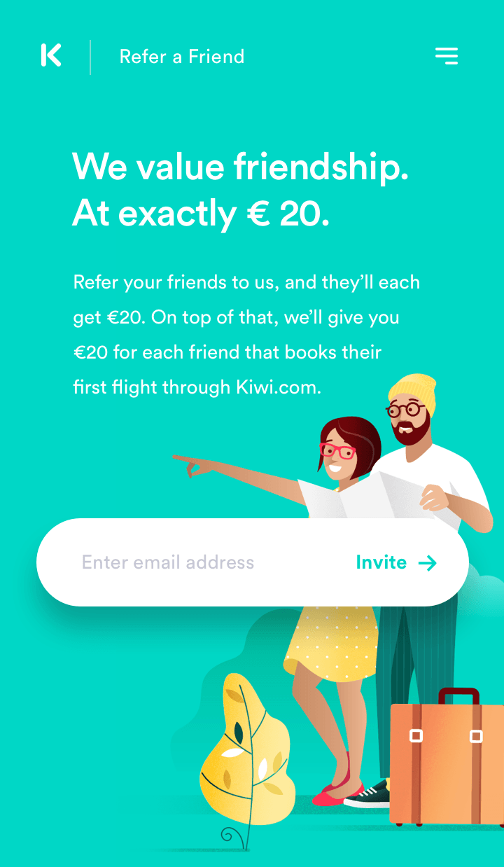
Many copywriters opt to use so-called "power words" in their copy. In short, "power words" are words that can trigger a psychological or emotional response. They're a fantastic way to get people's attention and give them the impression that you know what you're talking about. Examples of phrases that can work as good power words include "magic", "free", or "amazing" – use them together to make a more powerful headline.
Here's how Kiwi used the power word "value" to attract people's attention:
Keep It Short and Sweet
A good headline should be clear and to the point. You want it to draw people's attention, but you don't need to make it sound too exaggerated or fake.
Use Numbers
A good strategy to make your referral page more appealing is to use numbers in headings. Numbers are a good-old tactic for triggering people to read your content. By using a number in the heading, you're instantly hooking the reader's interest.
Talk About the Reward
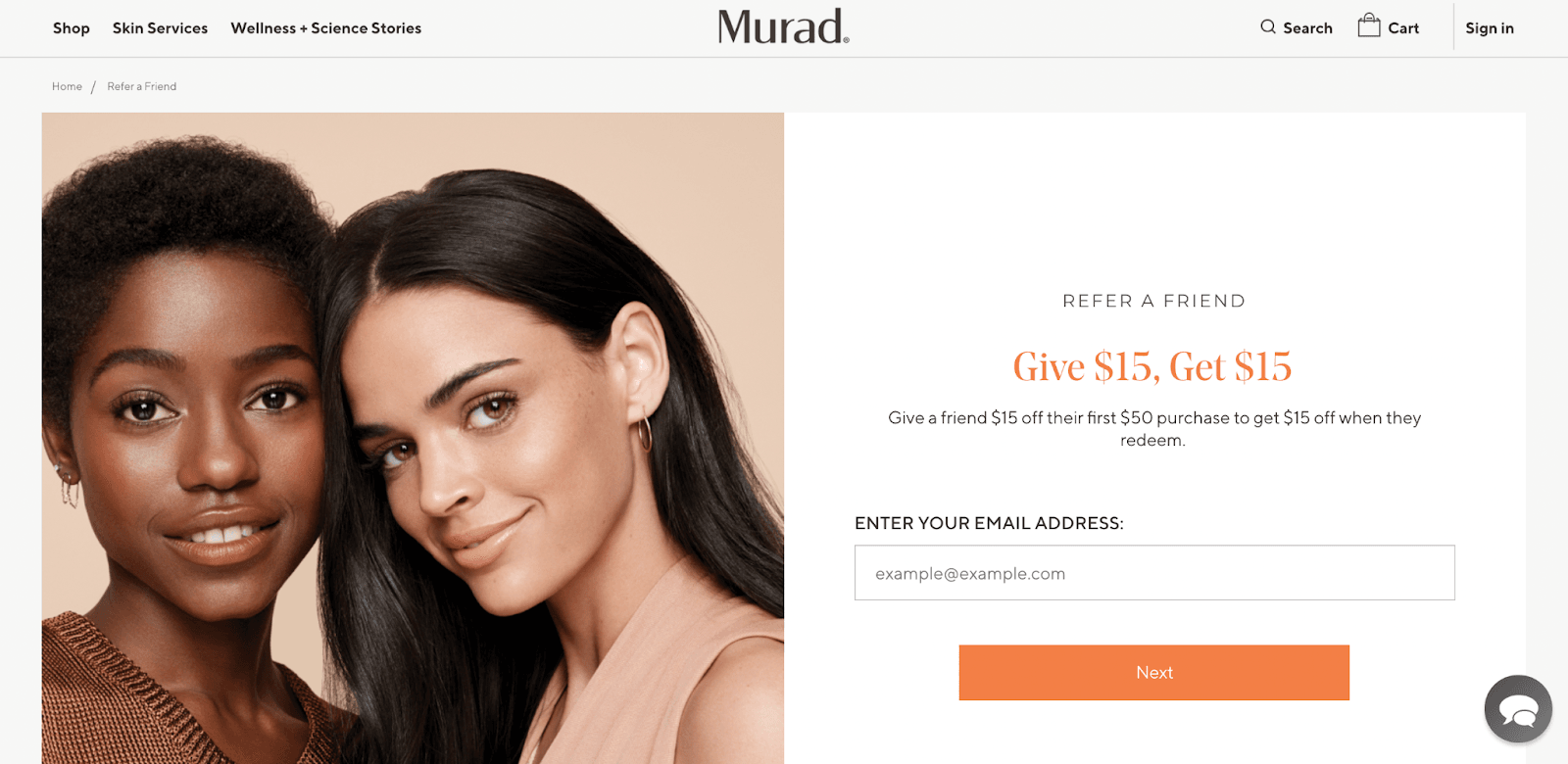
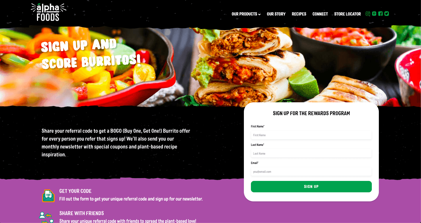
When you set up your referral page, it's important to mention the reward right away. People want to know if joining and sharing is worth their time or not, so make sure they can see that on your page quickly.
Here's how Murad made it simple for people to understand what they'll get by sharing the link:
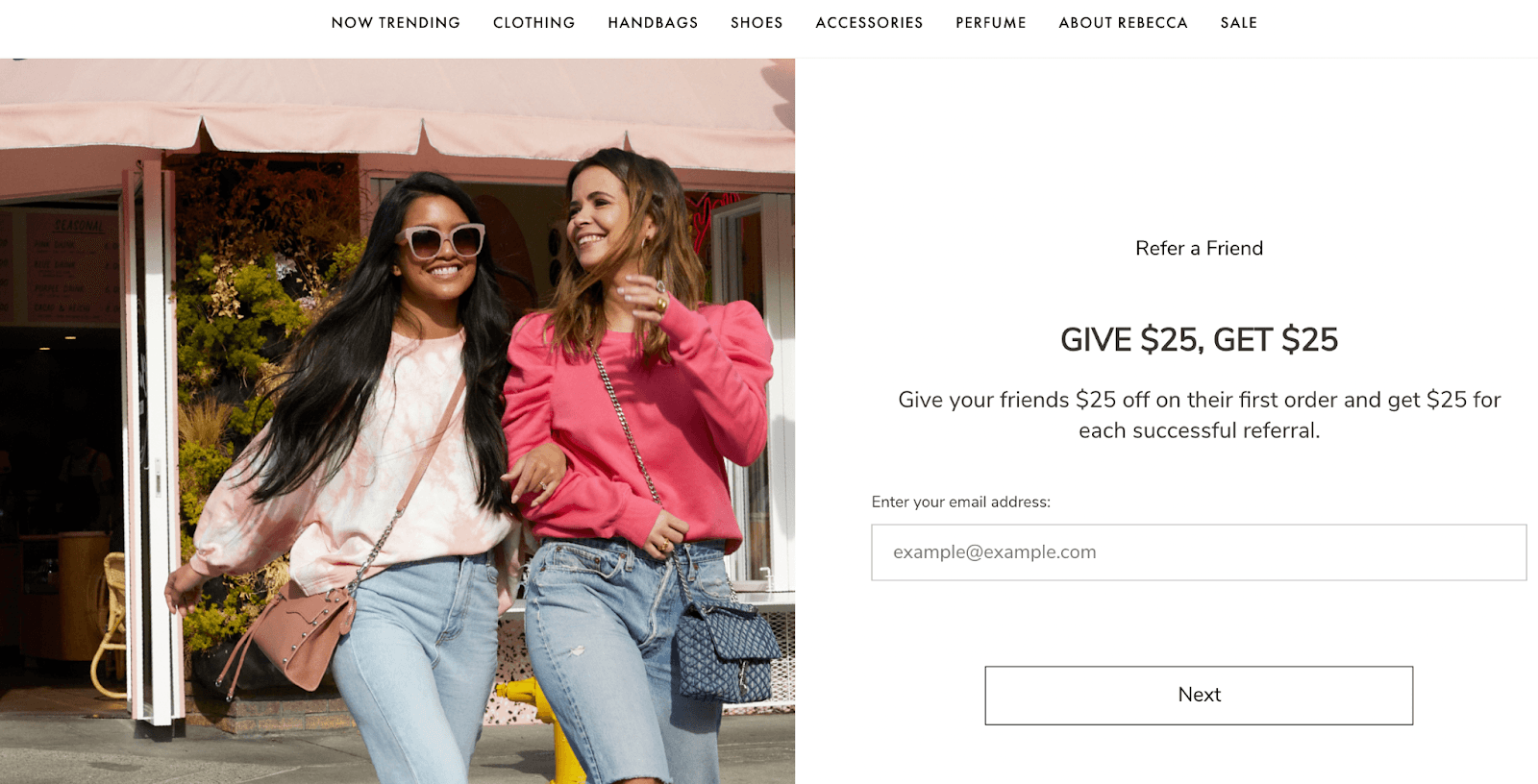
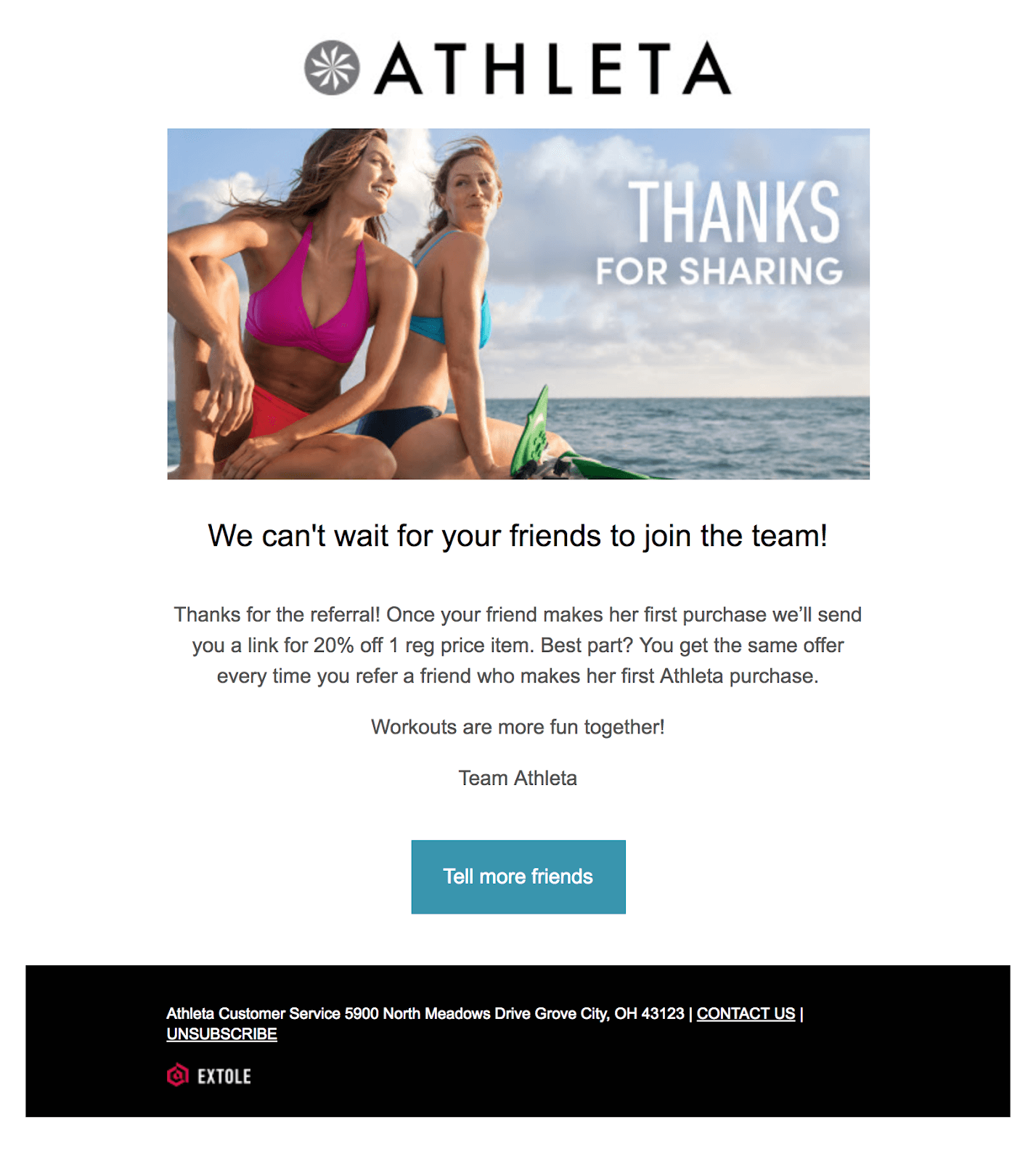
Make People Feel Good About Themselves
It's common for brands to use friendly words that tell visitors how their actions will affect them and other people. It seems to be a good strategy because it makes your customers feel good when they see these messages, making them more inclined to buy from you. They will often use words such as:
Love
Reward
Friends
Family
Help
Care
Win
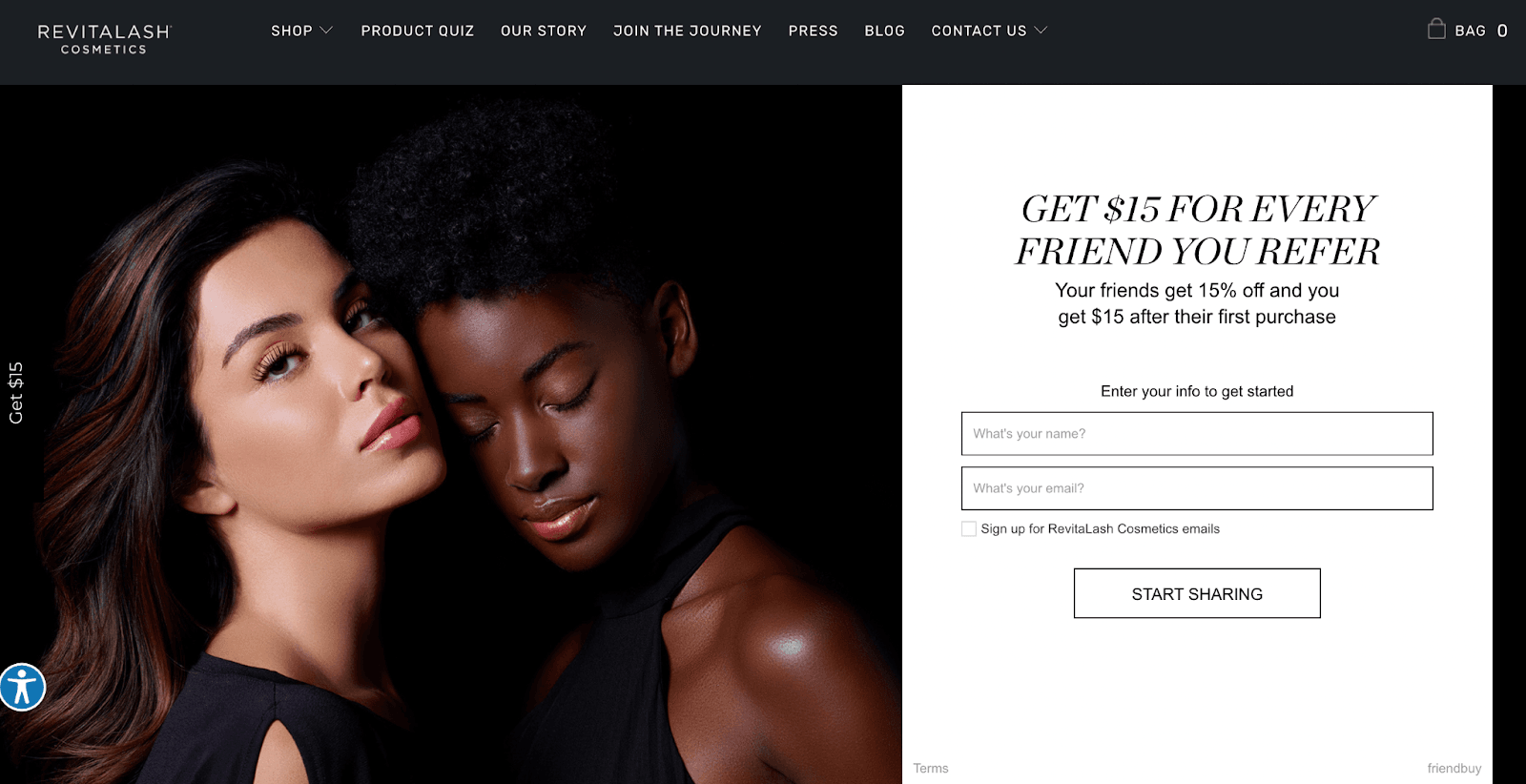
Rebecca Minkoff does this so well, and here's how:
2. Highlight the Key Benefits and Value Proposition
After capturing visitors' attention with a compelling headline and subheadline, the next step is to clearly articulate the key benefits and value proposition of your referral program. This section should answer the question, "What's in it for me?" by highlighting the rewards, discounts, or exclusive perks that customers can earn by referring friends and family.
Why should your customers enter your referral program? What do they stand to gain? Will they be getting something special, or will they be wasting their time?
That's why you should explain the benefits of your referral program, even if that's only in a few sentences.
Best Practices for Explaining Benefits
Don't Go Overboard With Words
If you've been staying up-to-date with recent reports on key digital marketing trends, you'll know that the average person's attention span is 12 seconds.
That's 12 seconds to convince them to become a lead or a customer.
When explaining the benefits of your referral program, keep the following best practices in mind:
Use clear, concise language that's easy to scan and understand at a glance.
Highlight the most compelling benefits and rewards upfront.
Consider using bullet points or short paragraphs to break up the information.
Align the messaging with your brand voice and tone.
Reinforce the value proposition throughout the page.
Make it Informative
Ensure the user can understand how signing up for your referral program will benefit them. For example, use a short blurb to describe the benefits right under the headline. It should be short and sweet, but also explanatory.
3. Use Visually Appealing and Relevant Imagery
Visuals play a crucial role in capturing attention and reinforcing your referral program's value proposition. Use high-quality, relevant imagery that aligns with your brand and resonates with your target audience. This could include product shots, lifestyle imagery, or graphics that represent the rewards or benefits of your program.
Consider using a hero image or video that showcases your product or service in action, or that represents the aspirational lifestyle or experience your customers are seeking. This can help visitors visualize the benefits of your offering and make an emotional connection with your brand.
For example, you can have a flattering image of your product or people having fun in front of your product. The end goal of the photo would be to tell a story and evoke an emotion. The power words we talked about earlier are only going to complement the image.
Remember, visuals should complement and reinforce your messaging, not distract or confuse visitors. Ensure that any imagery used is high-quality, relevant, and aligned with your brand's aesthetic and tone.
In short, the image will tell what can not be told with words.
Here Are Some Ideas to Help You Design an Eye-Catching Image
Have One Main Image That Will Impress
The main image of your landing page is called a hero shot. A hero shot is a full-size photo or video that captures the beauty of your product/service. It's meant to showcase what you're selling, so make sure it does just that!
You can add the text below or above the image or even on the side, but keep it minimal to avoid distracting the visitor from the image itself.
A good rule of thumb to follow for making a hero shot is that there should be at least 60% of the photo dedicated to showing off your product.
And it goes without saying that the image must be of high quality. The better the image, the higher the chances that the customer will share your product/service with their friends and family. Avoid using copyright-free images – they're not unique and won't impress the customer.
The Image Should Be Relevant
Let's imagine that your product is a smartwatch. You don't want to use flowers or cupcakes as the hero image on your landing page.
If you're not sure if your images are relevant, ask yourself, "is it clear what the product is from this image?"
If the answer is no, then rethink your hero shot.
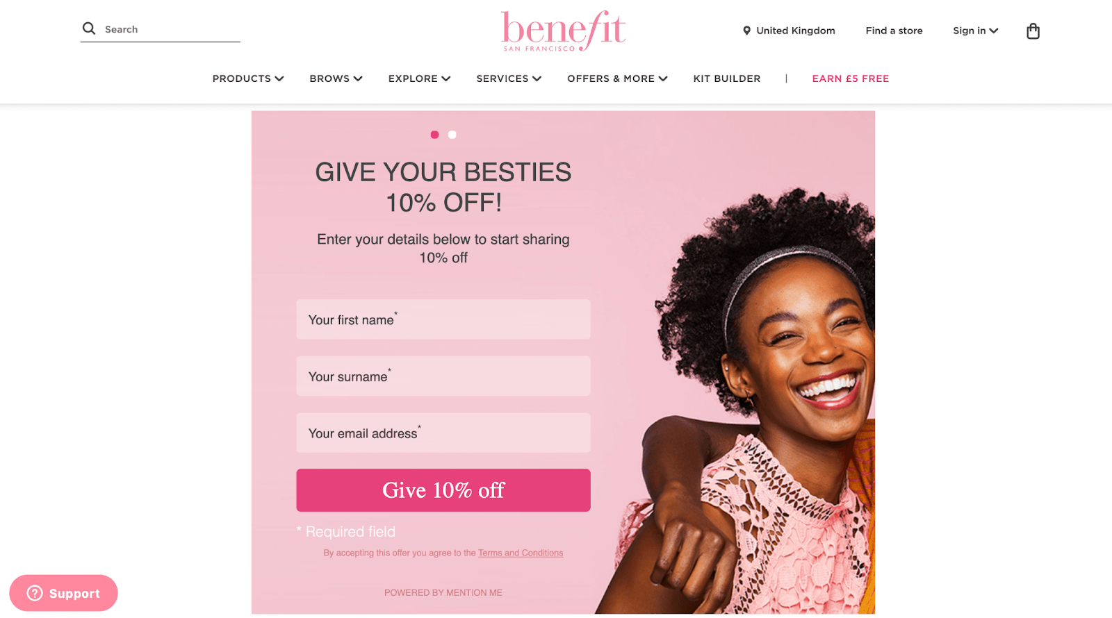
Pair It With an Awesome Title
As we mentioned earlier, the image should take center stage. You're adding a title only to intensify the positive feelings the customer would get by looking at the image. For example, look at how Benefit Cosmetics has done the trick by using the super awesome title "Give your besties 10% off."
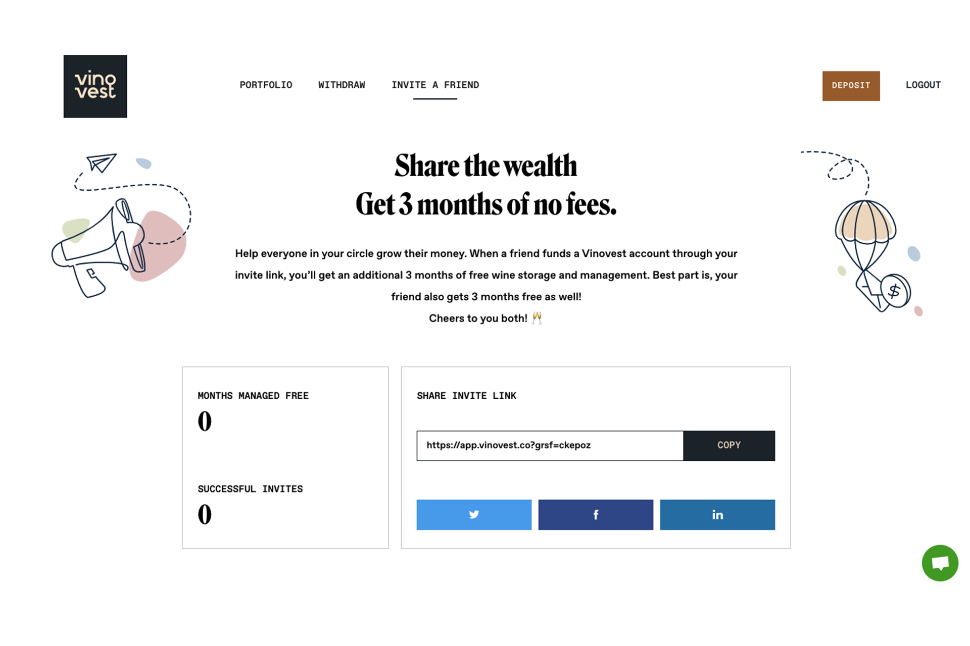
4. Add a Low-Friction Form
Let's make this short: friction is any element on your landing page that causes your customers to resist clicking on the CTA button. They can arrive on your landing page and do nothing because of friction.
So here's the next tip: make it easy for customers to refer friends by including a low-friction form on the landing page.
Make sure that the form is as easy to complete as possible. If it takes too much time, your customers won't hesitate to leave the page.
Use single-click checkboxes and input boxes so that your customers can just fill in their information without any extra work on their part!
The psychology behind low-friction forms is simple: people will click on things that are easy to do. Making the form as simple as possible can be critical in convincing your customer to take the leap from just browsing to becoming a brand ambassador.
Here Are Some Ideas to Help You Create a Low-Friction Form
A/B Test the Landing Page
It's never a bad idea to A/B test parts of your website. When it comes to your customer referral landing page, you can play with different words, colors, visuals, and form fields. For instance, you can have a test where you measure whether customers convert better when there's one input box or two.
Place the Form Above the Fold
Place the form above the fold so that it is the first thing a visitor sees when they load your page. Doing so can yield better results as it instantly draws the attention of your visitors to the CTA. The result is a higher conversion rate.
Include White Spaces
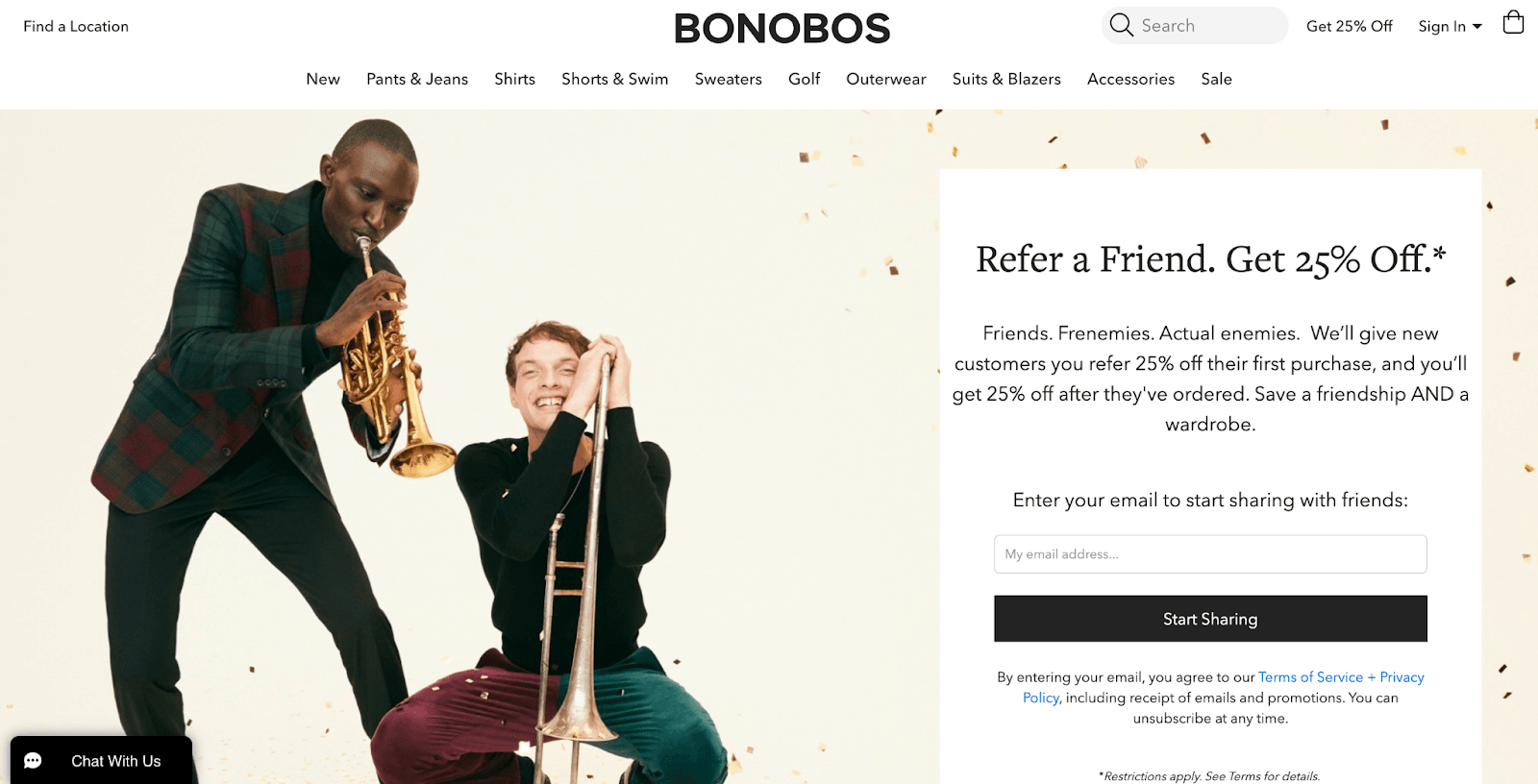
It's essential to make sure that customers can see everything. They should not have any trouble understanding the whole page or will likely leave without doing anything. If the page looks clattered, customers will only get confused and hesitate to get involved in your referral program.
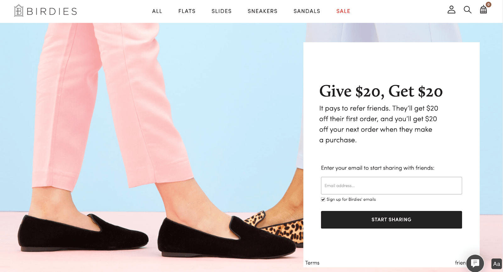
Here's how Bonobos do it:
5. A Clear CTA (Call To Action)
How do you convince customers who land on your referral page to share the word with their friends and family?
That's simple: you add a clear CTA!
Without a CTA, your customers won't know what they should do on your page. If they don't find the needed information in a few seconds, they're likely to quit and go to a different website.
Unfortunately, not all CTAs are created equal. Some are catchy, persuasive, and powerful.
Others are boring and unappealing.
What you must do is create CTAs that will compel the customer to convert.
Here Are Some Ideas to Help You Create Strong CTAs
Use Action Words
Action words motivate the customer to take action. They're on-point, powerful, and tell the customer exactly what they need to do on the page.
Let's take a look at some examples of CTAs that include action words:
Share on Facebook
Share this sale and get $5
Introduce us to your friends
Share your referral link today
Register now
Start saving
Send email
Start sharing
Refer and earn
Pay Attention to Design Best Practices
Having a referral page with a cream-colored CTA button on a white background isn’t going to increase your conversions, is it?
Yes, designing your CTAs right can be detrimental in motivating your customers to proceed or go back.
Here are some tips:
Make sure your button stands out by using white space effectively
The CTA should contrast with the colors on the rest of the page
If necessary, frame the button to increase the contrast
Make the CTA button large enough to be seen but not overwhelming
Make It Easy to Find
The placement of the CTA button is equally important as its design. Place it on the wrong spot, and you'll see customers leaving the page without converting.
But make it easy to find, and it can work in your favor.
Customers should scroll down on the page to find the CTA button. Instead, you should place it above the fold where it's visible and makes sense.
Here's another tip: if your landing page is long, consider adding several CTA buttons.
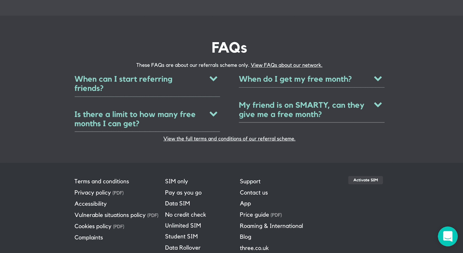
6. Add a FAQ section
Here's something you may not know: FAQ sections can be used as a powerful marketing tool.
FAQ sections are an easy way for customers to find answers without having to contact you directly, and they can also help you capture leads or even convert them into sales.
Having a question-and-answer section on your referral page gives you a great opportunity to offer a thorough explanation of your program without compromising the headline and the CTA that you have placed above the fold.
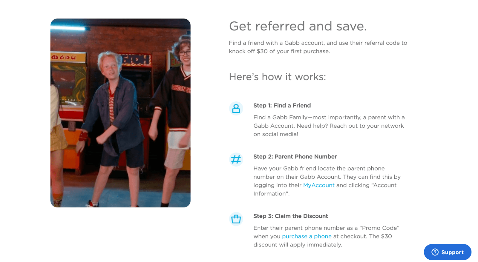
Tip: An alternative to a FAQ section is a How It Workssection where you walk customers step-by-step into how your referral process works.
Gabb Wireless has managed to nail the How it Workscopy. Take a look at the example below:
Here Are Some Ideas to Help You Create a Great FAQ Section
Find Out What Questions Your Customers Are Asking
The first thing you need to do is identify what questions your customers are asking about your referral program. This will help determine what topics and questions need to be addressed in the FAQ section. Typical questions may include understanding what a referral must do to count as a referral and how one can view their reward progress.
And how do you discover that information? It's simple! You talk to the people who know your customers the best: sales and support.
Ask them what questions your customers most often ask and put together a list.
Be Concise In Your Answers
Answer the questions clearly and concisely. They shouldn't be longer than 100 words. Also, don't forget to update your answers and questions regularly, based on new information provided by your sales and support teams.
Think About the Text Display
There are several ways to display answers, including:
Expanding-answer test: the customer only sees the question, but the answer is displayed if they click on it.
Questions-only displayed: customers see a list of questions, and clicking on each question opens a separate page where customers can read the answer.
Questions and answers displayed: customers can see the question and the answer on the same page.
Open in a new page: some businesses opt for a single CTA on the main landing page that takes customers to an entirely new page that's reserved only for providing detailed answers.
Use Your Brand Voice
The brand voice is the personality of your company. It's what separates you from competitors and gives customers a reason to choose you. Using your brand voice can help establish your business as an authority on the subject while also making customers feel like they're speaking directly with someone they know well – someone that understands them and their needs. With that being said, make sure your FAQs are consistent with the brand voice of the rest of your website.
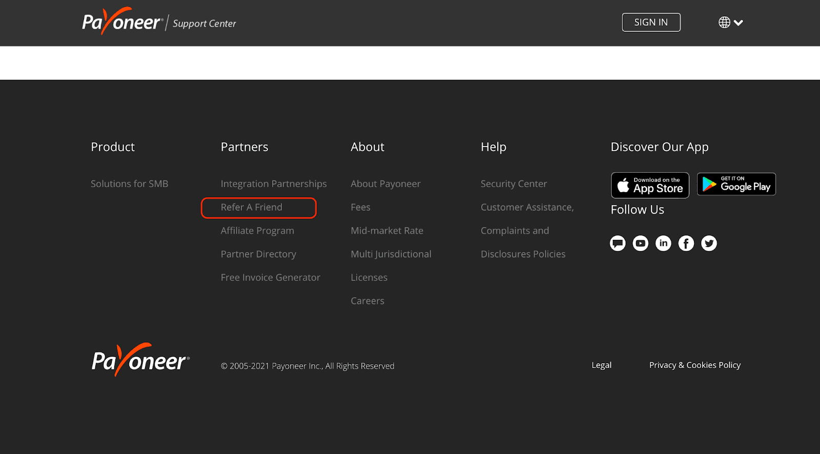
How to Promote Your Referral Page
Make Sure the Program Is Discoverable
Now that you have successfully created your custom referral page, it's time to make it easily discoverable to your customers.
In short, customers should be able to find the referral page on the website with no difficulty. Make sure it is easy for them to get there and that you are not sending customers off-site unnecessarily.
Some of the best places to add a link to your referral page include:
Your homepage
Website menu or footer
Blog posts
Email marketing campaigns
Newsletter
Thank you or confirmation page
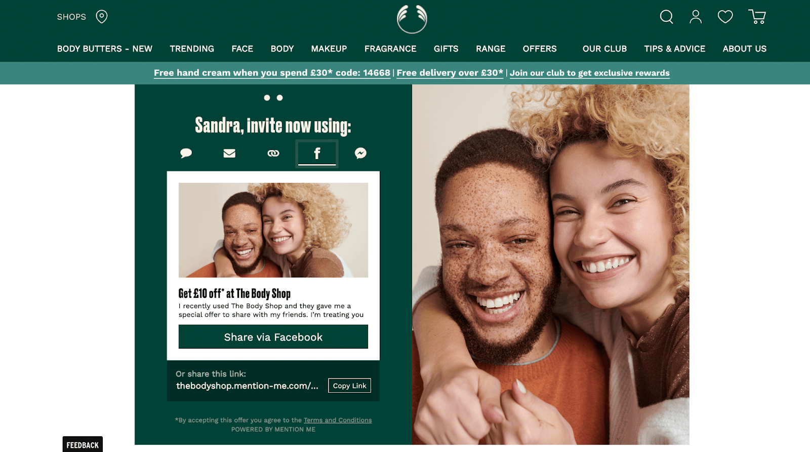
Enable Social Sharing
Why not make it easier for your customers to share the good word? In addition to letting them refer a friendby email, consider enabling social sharing, as well. Include the option to share the link on every platform that your target audience frequents. It's a great way to reach a wider audience and encourage new people to become customers. Here's how:
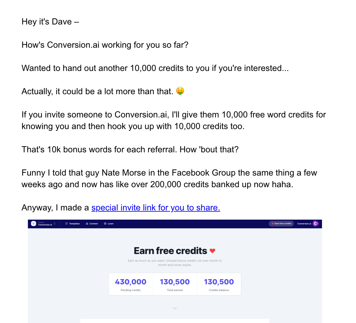
Send Email Campaigns
One of the best ways to promote your program is through email. Consider scheduling triggered or time-based email campaigns. For instance, you can send emails a few days after someone purchases to encourage them to share a referral link and get a reward on their next purchase.
You can also send these emails to customers who have not yet made a referral but are in the top tier of your program and would be eligible for more benefits if they do.
You can also let customers know about referral benefits in other ways, like adding a pop-up when they're signing up to enroll or waiting for their orders, sending them an email with the subject line "Friends are joining," and running contests on social media. You'll want to be sure you have a strong call-to-action in these messages to ensure that your customers know what they need to do.
Show Customers Your Appreciation
If you want to get more personal, you can also try sending a personalized email to every customer who has referred someone in the past. The emails should thank them for their support and remind them about your program, but they may be most effective if they're sent at just the right time – when it's been a while since an existing customer made a referral or when somebody new has referred someone.
The Bottom Line
We arrived at the end of our post.
After a great deal of explaining and diving deep into details, we've concluded that a well-designed and put-together referral page is key to getting customers to share your product or service with others.
No, referral pages are not easy to create, and if you thought you could do it in a few hours, think again.
The reality is that referral pages demand employing great talent with various skills who will work together on designing, writing, and developing your page by following your brand's voice and your industry's best practices.
Using a referral software like GrowSurfcan save weeks of time with our out-of-the-box referral page features like social sharing customization and email automation.
Remember, only a great referral page can motivate your customers to spread the word about your business. So make sure you pay attention to the wording, imagery, and CTAs you use.
We hope these tips will help you take your referral program to the next level.
GrowSurf is modern referral program software that helps product and marketing teams launch an in-product customer referral program in days, not weeks. Start your free trial today.
GrowSurf is modern referral program software that helps product and marketing teams launch in-product referral and affiliate programs in days, not weeks.


 Salesforce
 Stripe
 HubSpot
 Chargebee
 Recurly
 PayPal
 Tango Card
 Webhooks
 Zapier