Put your growth on autopilot
GrowSurf is modern referral program software that helps product and marketing teams launch an in-product customer referral program in days, not weeks. Start your free trial today.
What is now the largest retailer in the world came from humble beginnings. When Jeff Bezos first founded Amazon in 1994, the company was a small online bookstore run from his own garage. This once humble venture has grown to a valuation of $1.6 trillion, making it one America’s “Big Five” beside companies like Facebook and Google.
Amazon remains best known for their digital marketplace. Many Americans use Amazon on a weekly basis preferring the wider selection of products and price points available online. Outside of the one-stop-shop, over 30 subsidiary companies offer a wide array of services, from fabric to pharmaceuticals. These lesser divisions contribute substantially to Amazon's overall revenue.
For instance, Amazon Prime. This popular add-on service currently boasts 200 million members across 19 countries. Amazon Prime is a monthly or annual subscription. Customers receive exclusive benefits such as unlimited next day (sometimes, same day) delivery at no extra cost. The Prime account also gives users free access to their library of movies and tv shows. Maybe you heard about it from a friend?

Word-of-mouth marketing driven by their referral program can be thanked for Amazon Prime's rapid spread. Amazon Prime's revenue totals over $25 billion in subscription fees alone. That's 6.5% of Amazon’s total revenue!
As with most referral programs, Amazon incentivized users to refer their friends by offering coupons redeemable on Amazon’s site. The program was discontinued as of October 2017. Simply put, Amazon outgrew the reach of their own referral program. Being a household name, they hit a plateau where customer referrals were no longer viable at their scale. Could there be a better measure of success?
Let’s take a look at the 5 lessons we can take from Amazon Prime’s referral program.
Emotional marketing is the use of persuasive images or text to evoke emotions in humans. These natural responses prompt users to perform a specific action.
Magnus Söderlund studied “why smiles sell”, concluding that humans are hardwired to mirror the emotions of what they perceive in others. If consumers associate a product or service with the happiness of others, they become more likely to convert. After being groomed by this simple strategy, consumers are also likely to spend more.

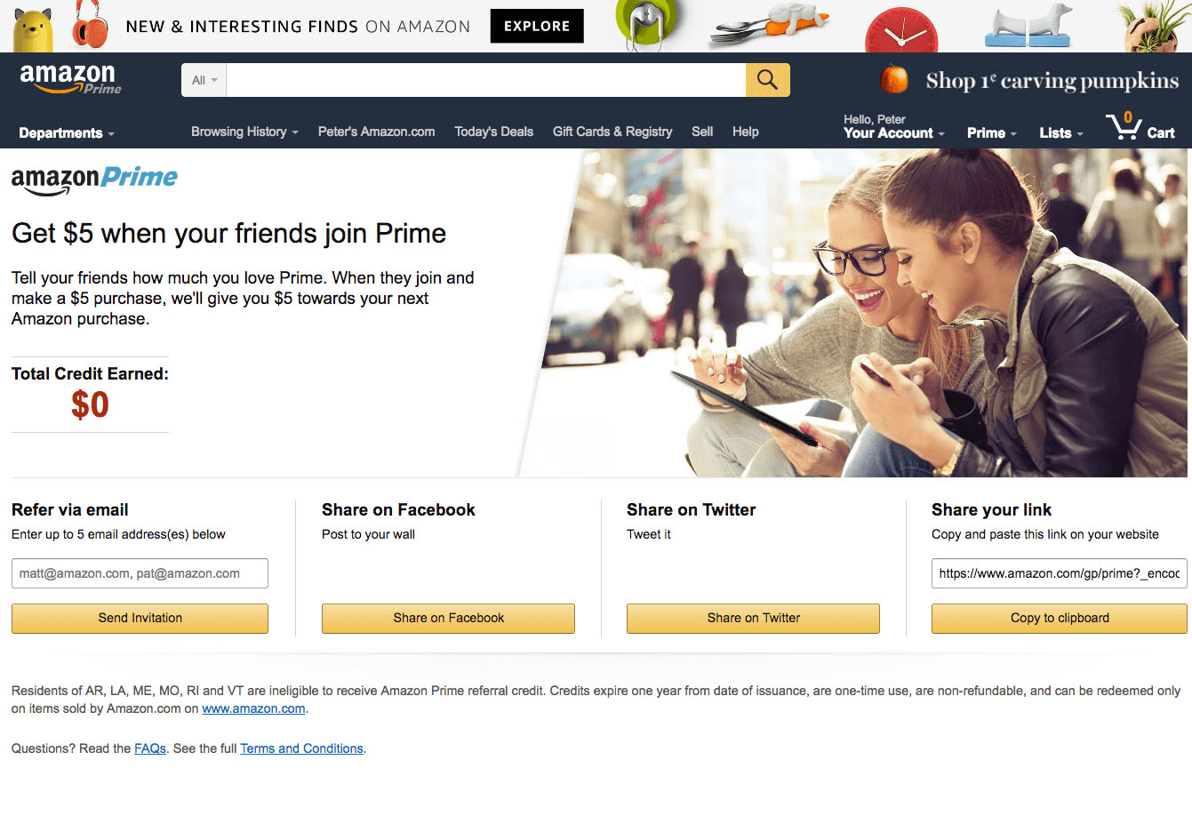
Amazon Prime’s referral page used images of smiling friends sharing cheerful moments, exaggerating the emotional satisfaction of sharing. These warm fuzzy feelings encouraged users to refer Amazon Prime to their friends. Isn't that sweet?
When someone invited you to try Amazon Prime, it was personal. Your friend's name was in both the subject line and is repeated in the body of the email. The experience felt less auto-generated when the familiarity of a friend's name was attached to it. Also, the use of the referrer’s name simulated contact with a trusted source. This personalization was shown to increase the number of sign ups from referrals.
Consumers that have been referred by a friend 4 times are more likely to buy.
Personalizing referral invites also helps to drive social currency by getting users to identify and affiliate themselves with Amazon, then sharing their affiliation with their circle.
Amazon Prime is a high value subscription. The low-cost benefits package is enough to generate interest in membership. To make the customer experience as streamlined as possible, Amazon Prime has optimized onboarding with user-friendly landing pages for signups and engaging CTA buttons.
Using clear CTAs helps to move leads through the sales funnel, and ultimately increase conversion rates. The CTAs on Amazon’s marketing materials are effective for 3 reasons:
Location: Above the fold. Amazon Prime’s referral pages have their CTAs in plain sight, making it impossible for users to overlook. Page design helps emphasize the importance of a call to action, leading to higher conversions.
Contrast: Amazon uses contrasting colors for their background and CTA. The stark definition between the button and copywriting makes the CTA more visible.
Clear Copy: The copy on the CTA buttons explicitly states what the user will receive when clicking. Saying ‘Start your 30 day free trial’ is much more effective than saying ‘start your free trial’ or a generic ‘find out more’. Less isn't always more, there's no need to be elusive here.
Amazon Prime's referral program was open to all users, even those who didn’t use Prime themselves. By not restricting who could take part in the program, Amazon was able to increase their participation rate, which is one of the most important factors of any successful referral scheme. This was a great way to promote the referral program to a widespread audience.
Users were also able to choose from a number of ways to share their referral invite. They could send it via email, social media, or generate shareable links. This added flexibility also helped to increase the participation rate as users could invite their friends using whichever method they preferred.
Using social share buttons in your referral program will give you the potential of driving viral growth. When people share referral links with their followers and contacts on social platforms, more people are likely to see it. Interest in your referral program is driven by this added social currency. Even if you’re an SEO or email focused business, don’t underestimate the power of social media chatter.
Some companies make the mistake of being too pushy when trying to promote their referral program. It’s common for people to shop for products and services online because they avoid being confronted with pressure tactics. Nobody wants to feel like they have been ambushed by a living used car salesman stereotype, over-eager and slinging jargon.
If it comes across too much like a sales message, chances are you will have a low participation rate.
The Amazon Prime referral page leverages smart UX design. Great copywriting helps to make the offer more approachable and comfortable, less sales-y. Everything in their emails and landing pages are designed purposefully to make users feel like they are in control.
Asking for referrals is a crucial skill that requires balance. Marketers need to exercise restraint and be mindful of this when setting up an effective referral strategy.
Use personalised referral invites to increase sign-up rate and social currency .
GrowSurf is modern referral program software that helps product and marketing teams launch an in-product customer referral program in days, not weeks. Start your free trial today.
Are you looking for guerrilla marketing ideas to excite your imagination? We have 10 real-life examples that can inspire your next profit-making campaign.
Word of mouth marketing can be the strategy that skyrockets your business and takes it to another level. Here we tell you all you need to know about it.
Are you not sure what to include in your referral program FAQs? Take a look at the most common questions people may have regarding your program.