An effective call-to-action (CTA) is critical if you want your prospects to take the desired action on your website, whether that's making a purchase, signing up for a newsletter, or downloading a resource. A well-crafted CTA can be the difference between a bounce and a conversion, so it's essential to get it right.
While the concept of a CTA may seem straightforward, crafting one that stands out and compels action is easier said than done. With so much digital noise and competition for attention, your CTA needs to cut through the clutter and give visitors a clear, compelling reason to click.
That said, if you want your prospects to perform your desired action, you need to do more than make your CTA visible. Your CTA should be strategically placed, visually prominent, and use persuasive language that taps into your audience's motivations and pain points. As HubSpot notes, the best CTAs guide visitors through the buyer's journey and inspire action.
You need to write a CTA that grabs attention and inspires action by:
Using action-oriented language and creating a sense of urgency
Highlighting the value and benefits to the user
Aligning the CTA with the user's stage in the buyer's journey
Ensuring the CTA is consistent with the surrounding content and messaging
Because in a digital landscape that becomes more cluttered and competitive by the day, every word and design element of your CTA counts. The best CTAs strike a balance between clear, concise copy and visually appealing design that makes them stand out on the page. As Wix emphasizes, contrasting colors, strategic placement, and mobile optimization are all key factors in creating clickable CTAs.
Want to write CTAs that convert?
This blog post will tell you how. Better yet, we’ll also provide you with 15 call to action examples that will inspire you as you write your own.
What is a call-to-action (CTA)?
A call to action (CTA) is a written statement, button, or other visual element on a website that prompts visitors or prospects to take a specific action. CTAs can take many forms, including:
Buttons (e.g. "Buy Now," "Sign Up")
Text links (e.g. "Learn More," "Get Started")
Banners or slide-ins
Pop-ups or modals
Embedded forms
The goal of a CTA is to guide users towards a desired conversion, whether that's making a purchase, signing up for a newsletter, downloading a resource, or any other action that aligns with your business objectives.
To be more specific, a CTA is designed to make visitors take a specific action that will help you achieve your marketing and business goals. This could include making a purchase, downloading a lead magnet, subscribing to an email list, booking a consultation, or any other desired conversion. The key is to align your CTA with the user's stage in the buyer's journey and present a compelling next step that moves them further along the funnel.
Why are CTAs important?
CTAs are a critical component of any effective marketing strategy because they bridge the gap between attracting visitors and converting them into leads or customers. Attracting new visitors is just the first step – without compelling CTAs, those visitors are unlikely to take the desired action that moves them further along the sales funnel.
As HubSpot notes, "the best CTAs guide visitors through the buyer's journey and inspire action." Well-crafted CTAs not only tell visitors what to do next, but also why they should do it, addressing their pain points and highlighting the value proposition.
Relevant to the user's needs and stage in the buyer's journey
Visually prominent and attention-grabbing
Persuasive in highlighting the value proposition
Consistent with the surrounding content and messaging
Aligned with your overall marketing and business goals
Your website may be well-designed, fast, and have top-notch content, but all that effort will be wasted if your CTAs fail to effectively guide visitors to take the desired actions. As Wix emphasizes, "implementing good CTAs is essential for your business's growth as it can significantly impact the success of your marketing strategies, and specifically your conversions, sales and lead capturing efforts."
Poorly crafted CTAs that lack clarity, relevance, and persuasive power can lead to high bounce rates, low conversion rates, and ultimately, missed opportunities for growth.
The web is a noisy place, and your prospects are bombarded with countless messages and offers vying for their attention. They don't want you to add to that noise – they want clarity and direction. Once you've grabbed their interest with compelling content and messaging, your CTAs need to provide a clear, logical next step that aligns with their needs and stage in the buyer's journey.
As HubSpot notes, "the best CTAs guide visitors through the buyer's journey and inspire action." Boring, vague, or misaligned CTAs can confuse and frustrate users, negatively impacting the customer experience and potentially leading to higher bounce rates and churn.
How to write a call to action that converts
Here are tips and hacks to writing a call to action that prospects will respond to.
1. Make it relevant
When writing a CTA, the idea is to get your prospects to take action that moves them further along the buyer's journey. To achieve this, your CTA needs to be highly relevant to their specific needs, pain points, and stage in the funnel.
As Wix advises, "If you can anticipate your audience's 'lead temperature' and readiness, you will be able to best influence their choice in clicking. Is the user realistically ready to 'Buy now,' or would they prefer to 'Download' more information first?"
Relevance also extends to ensuring your CTA aligns with and reinforces the surrounding content and messaging. Inconsistencies or disconnects can confuse and deter users from taking the desired action.
You have to make sure every element on the page is there to support your CTA. If there's no consistency in the messaging and content surrounding your CTA, you're going to leave your prospects confused. And confused people aren't likely to download your ebook, register for your webinar, or buy your product.
As Wix emphasizes, "If there's no consistency in the messaging wherever your CTA is presented, you're going to leave your prospects confused. And confused people aren't likely to download your ebook, register for your webinar, or buy your product."
Examples of CTA phrases that signal relevance and align with the user's stage in the buyer's journey include:
For top-of-funnel awareness: "Learn More," "Download Our Guide"
For mid-funnel evaluation: "Get a Free Quote," "Schedule a Demo"
For bottom-of-funnel decision: "Start Your Free Trial," "Buy Now"
The key is to use language that resonates with where the user is in their journey and what logical next step would help move them further along.
Active your 30-day free trial today!
Add to cart
Join the club
Yes! I want in
Send it to me!
Appeal to emotion
While logic and reason have their place, if you want your CTA to truly inspire action, it needs to tap into your prospects' emotions on a deeper level. As Harvard Business School notes, "95% of purchasing decisions are emotional. In fact, it's often said that people buy based on emotions and then justify it with logic."
By crafting CTAs that evoke powerful emotions like fear, hope, belonging, or curiosity, you can forge stronger connections with your audience and compel them to take the desired action.
Some powerful emotional triggers you can leverage in your CTAs include:
Hope and aspiration: "Achieve Your Dreams," "Unlock Your Potential"
Fear and urgency: "Don't Miss Out," "Limited Time Only"
Belonging and social proof: "Join 10,000+ Happy Customers"
Curiosity and intrigue: "Discover the Secret," "What Happened Next Will Surprise You"
The key is to understand your audience's core desires, fears, and motivations, and craft CTAs that directly speak to those emotional drivers in a compelling, yet authentic way.
Here are some compelling call-to-action examples that effectively tap into an audience's emotions:
For evoking fear and scarcity: "Stock is limited – claim yours now before it's gone!"
For instilling confidence and security: "Bulletproof your business with our ironclad solution."
For creating a sense of belonging: "Join our community of over 2,000 passionate learners."
For sparking hope and aspiration: "Take control of your financial future and achieve the life you deserve."
Notice how each of these examples goes beyond just stating a desired action, but also paints an emotional picture designed to resonate with the audience's deeper wants, needs, and pain points.
3. Communicate value
Humans are motivated by different needs and desires. Whether that need or desire is physical, emotional, or spiritual, it is almost always driven by the promise of a benefit.
At the end of the day, people take action because they believe it will deliver some kind of value or benefit to them. Whether that value is functional (saving time or money), emotional (feeling more confident or secure), or aspirational (achieving a desired outcome), your CTA needs to clearly articulate what's in it for the user.
As Wix advises, "If you can anticipate your audience's 'lead temperature' and readiness, you will be able to best influence their choice in clicking." By understanding your audience's needs and positioning your CTA as the solution, you increase the likelihood of conversion.
The impact of effectively communicating value in your CTAs cannot be overstated. In fact, research by Marketing Experiments showed a staggering 201% increase in conversions when replacing a bland CTA with one that clearly highlighted the value proposition to the user.
Some examples of value-driven CTAs include:
"Get Instant Access to Our Exclusive Training Videos"
"Save 50% on Your First Order – Limited Time Only"
"Unlock Your Free Personalized Fitness Plan Today"
Notice how each of these examples goes beyond just stating an action, but also communicates a specific, tangible benefit that the user will receive by taking that action.
Here are some more examples of effective CTA phrases that communicate value:
"Achieve financial freedom now!"
"Become an expert -- sign up today!"
"Join our community for exclusive content!"
15 Great CTA Examples And Why They Work
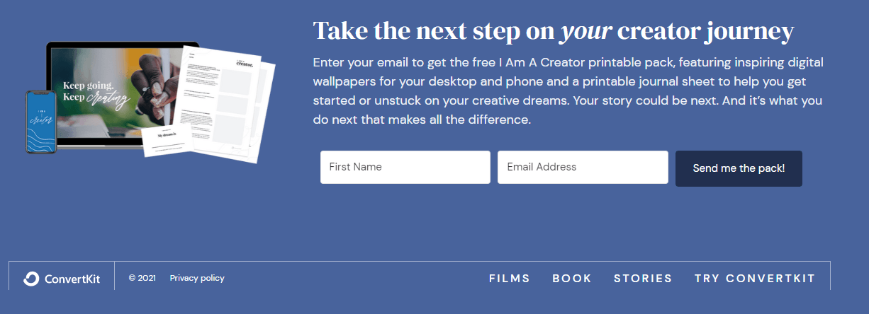
1. ConvertKit
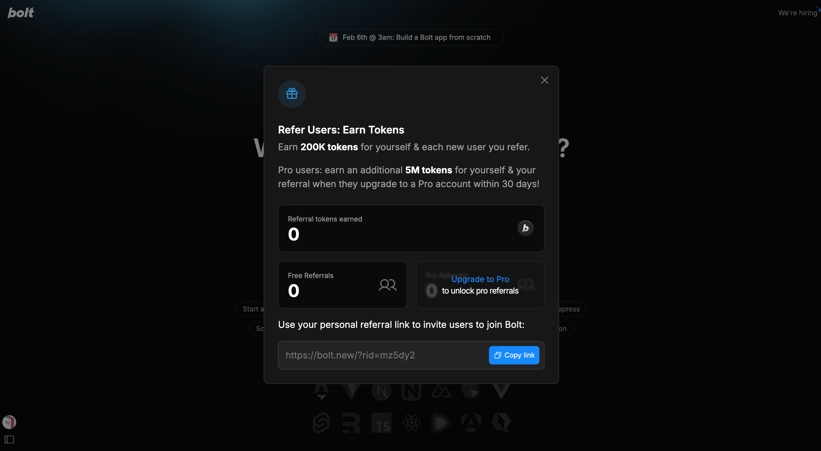
ConvertKit is a platform that has helped creators connect with their audience and make a good living out of creating content. The secret to their success? They provide creators with a clear path towards achieving success.
Case in point: this CTA.
Why the CTA works
The CTA works because every element in the copy builds up to a relevant and emotionally-charged CTA. The headline is easy to see and communicates a big benefit. Moreover, the rest of the copy expands on the promise of the headline. It also helps that it explains clearly how the offer will fulfill the promise made in the headline.
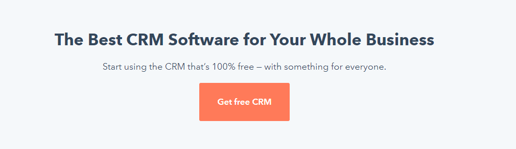
2. Hubspot
Hubspot has been a household name among marketing and sales professionals for years, and for good reason. Having one of the best CRM platforms in the market helps. Most of all, they know how to sell their product with a compelling CTA, as shown below.
Why the CTA works
This CTA ("Get free CRM") is effective because it emphasizes that the prospect is getting real value… for free.The entire layout is set up in a way that moves the reader's eye logically from headline to subheadline to the CTA. The stark contrast between the white space and the primary orange color makes the CTA copy hard to miss.
3. Whereby
Whereby's value proposition is to "make video meetings easy for you and your business." And true to form, they made it easy for prospects to sign up for the service with an effective CTA.
Why the CTA works
When you have a powerful headline and video working together to speak to your prospects' struggles and offer a promising solution, your prospect won't need much convincing to try your service for free.The CTA gives shape to the overall intent by making it clear to prospects that the service is free, making the offer even more appealing.
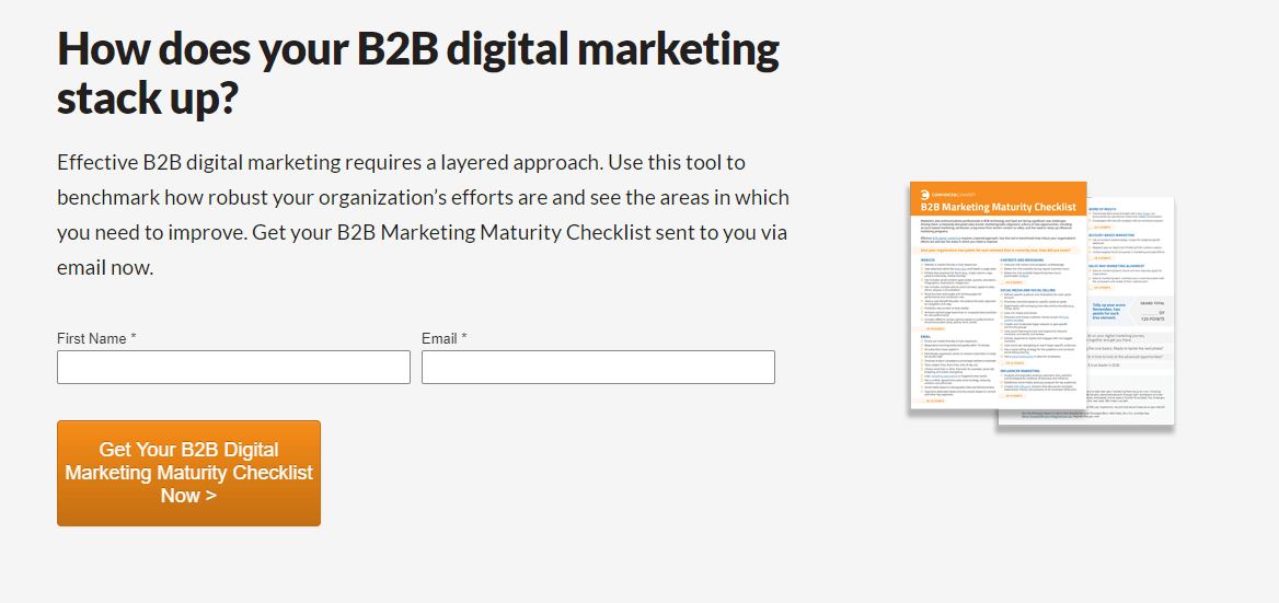
4. Convince & Convert
Convince & Convert is a consulting company that earned its stripes by knowing how to, well, convince and convert its target prospects. The company generated a ton of leads by leveraging their blog and offering content upgrades.
Why the CTA works
In their blog post ‘B2B Content Marketing Measurement Tips for 2021’, the company offers a free download of their B2B marketing maturity checklist. This works because the content upgrade is relevant to the blog post. Showing a sneak peak of what's up for grabs on the right makes the audience want the checklist even more.. Finally, the CTA copy makes it clear what the reader will be getting.
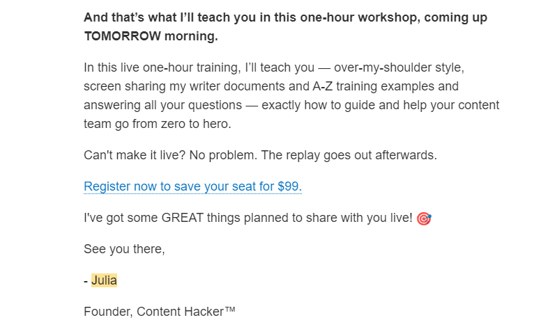
5. Julia McCoy's Newsletter
I'm a big fan of Julia McCoy's newsletter. The Express Writers founder offers free tips and resources to help creators, marketers, and entrepreneurs become more successful. Better yet, she offers paid courses and workshops to help them step up their game even more.
Why the CTA works
First off, THAT is how you sell a one-hour workshop in a newsletter. If the value proposition ("bring a writer up from zero to hero") doesn't leave freelance writers chomping at the bit, the sense of urgency expressed (coming up TOMORROW morning") in the rest of the copy will. This, of course, sets up an effective CTA. Why is it effective? First off, it makes the next step clear to the reader. Better yet, it conveys a sense of exclusivity, making the offer more desirable to prospects.
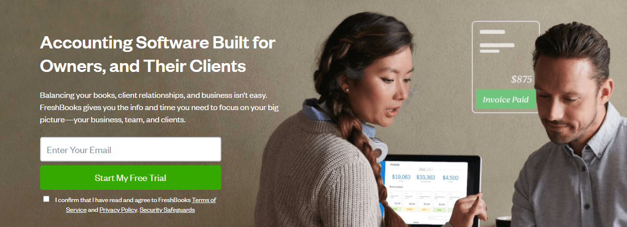
6. Freshbooks
Freshbooks is a cloud-based accounting solution tailored for freelancers and small business owners. It streamlines financial management and simplifies an otherwise complicated and painful process. And the company knows how to sell that advantage with their CTAs, as shown below.
Why the CTA works
Sometimes, the best way to craft a compelling CTA is to make the web copy and design elements do most of the work.The big headline works because it communicates clearly who the solution is for. The secondary headline then speaks to the needs of the target audience and lays out exactly how the solution will benefit them. The CTA then puts the finishing touches by putting the ball in the audience’s court.
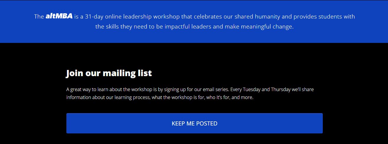
7. The altMBA
The altMBA is a 4-week digital leadership workshop designed by the Yoda of marketing himself, Seth Godin. The website’s homepage shows a playback video showing testimonials from some of the workshop's alumni. It also comes with a CTA that invites visitors to sign up for the mailing list.
Why the CTA works
As you can see, the CTA copy is not asking visitors to sign up for the workshop yet. It only asks them to join a mailing list. This is a good call. For one, the tuition is quite hefty. Second, not all applicants will be accepted. At this stage, visitors need more information before they are persuaded to join. For now, prospects are curious and excited and will want to know more. The CTA copy “Keep me Posted” is simple, but the fact that it’s relevant to the current needs of the prospect makes it effective.
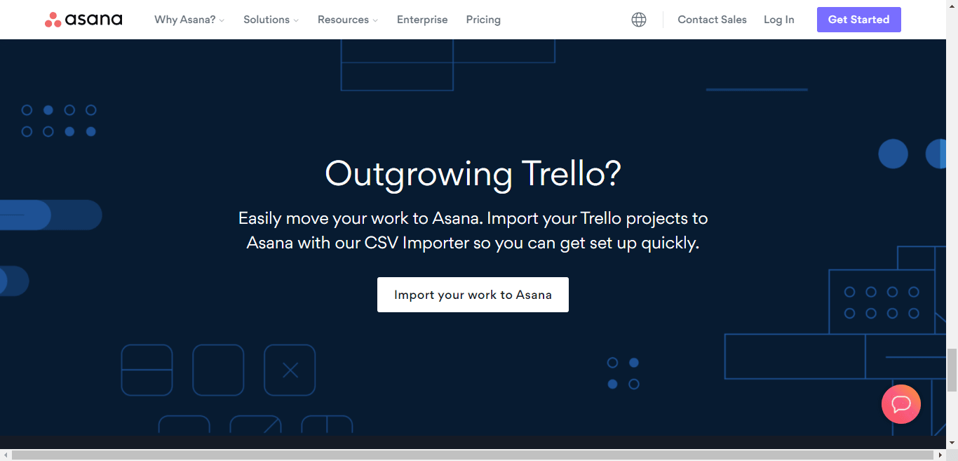
8. Asana
Asana is one of the most popular project management tools out there. If you've been keeping up with the project management tool wars, you know that Trello is one of their fiercest competitors. To steal some of Trello's customers, they created the following comparison page.
Why the CTA works
Asana went right for the jugular by using a question headline that dares disillusioned Trello users to confront a pain point they've been struggling with. The secondary headline then explains in simple, concise words why they should switch to Asana. It’s a good segue to the action-oriented and very specific CTA text (“Import your work to Asana”), don’t you think?
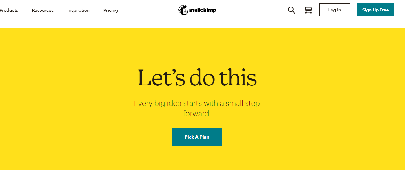
9. Mailchimp
Mailchimp prides itself as an all-in-one marketing platform. Being marketed as such, however, comes with its share of challenges. When your solution does just about everything, prospects might feel wary about making drastic changes.
With that said, Mailchimp does a great job in communicating why prospects should make the switch via its homepage and in particular its CTA.
Why the CTA works
You see the above image once you’ve reached the bottom of the homepage after a long scroll. I love the headline and the secondary headline because they create tension and imply big changes coming ahead. The CTA text is simple yet perfect in this context because it tells the prospects the next step they need to take.
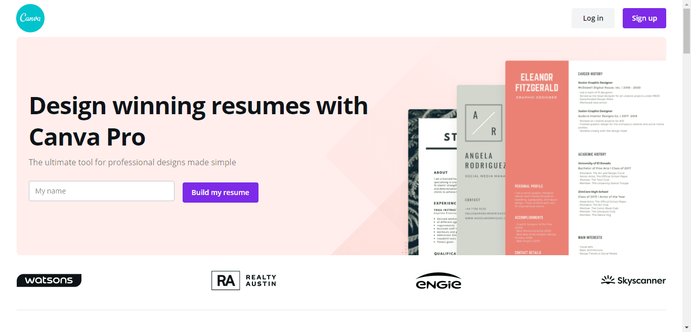
10. Canva
Canva is a design tool that does everything, including helping you create resumes that will knock people’s socks off. The design company makes sure you know it via the following page:
Why the CTA works
Canva does everything right with this landing page. Aside from communicating clearly their value proposition in both the headline and the secondary headline, they also presented a visual demonstrating why they are the best. The CTA is effective because it communicates clearly what will happen once a prospect clicks on the button.
11. Year Zero
August Bradley's Notion Life Design course provides tried-and-tested methods to elevate your performance across life and business. August continues to build a loyal following thanks to the following CTA.
Why the CTA works
First off, I like the part where the copy sells the CTA with a sprinkling of social proof ("Join 25,000 subscribers"). Also, joining the actual course is quite an investment, so offering the newsletter at this stage is a good call. There's enough in the entire homepage to spark curiosity and arouse desire. Adding a CTA that mirrors what the audience is thinking gives the entire pitch the push it needs to convince prospects to subscribe to the newsletter.
12. The Information
The Information is an online publication that delivers "tech news you won't read anywhere else." The content makes good on that promise, but the $39 subscription fee is a bit on the pricey side. Even if you don’t subscribe to the paid plan yet, you can still sign up for the free newsletter. Once a newsletter entry is sent to your inbox, you’ll see the following discount offer as you scroll down.
Why the CTA works
If the CTA copy "subscribe now" sounds generic, that doesn't matter because the email copy and design elements do all the heavy lifting. Displaying the discount numbers is a great decision because numbers grab attention. The words "Limited-Time Only" also creates a sense of urgency, making the CTA button more irresistible.
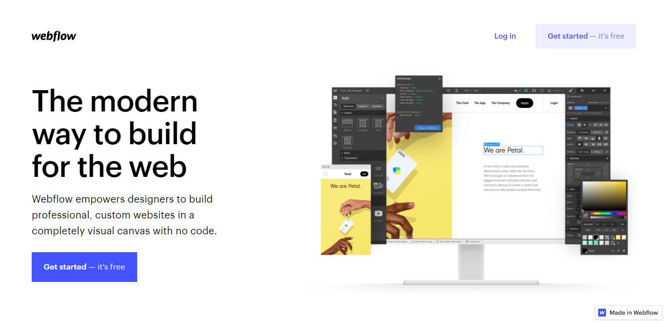
13. Webflow
As a website builder, Webflow is a game-changer. The people behind the low-code platform have no qualms telling the world about it, too.
Why the CTA works
Webflow's CTA is effective because it spurs prospects to action and puts emphasis on the risk-free nature of the offer. The headline does a good job selling the CTA by communicating the company's unique value proposition. Combined with a subheadline that supports that value proposition, you've got a winning CTA creators, designers, and marketers will find it hard to resist.
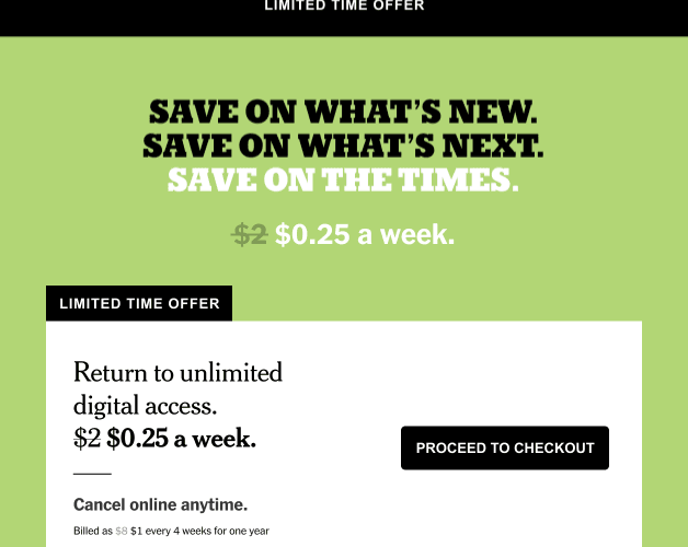
14. NY Times
When you're reading the New York Times, you know you're getting top-notch content. If you love quality journalism, chances are you’ll find it hard to refuse a massive discount offer to their digital subscription. If you’re a subscriber to the publication’s newsletter, you might have received the following discount offer.
Why the CTA works
First of all, I love the color scheme—it's distinct and plays with contrasts in a way that makes the important elements stand out like big neon signs. What's more, the" Limited Time Offer" bit makes the generous discount offer even more irresistible to prospects. And although "Proceed to Checkout" is a simple CTA, it gets the job done because it tells prospects exactly what they need to do next.
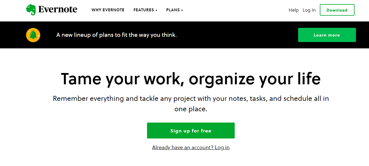
15. Evernote
“Tame your work, organize your life.” That headline alone makes it clear to prospects what Evernote is all about. Better yet, the rest of the copy as well as its design elements communicate effectively how the note-taking app can make their lives easier.
What makes the CTA work
As always, their use of the green color and negative space allows the most important elements—especially the CTA—to jump off the page, emphasizing the fact that prospects can "sign up for free."
Key Takeaways
Writing an effective CTA is a marketing superpower. After all, you can’t acquire customers and create an enduring relationship with them if you can’t find the words that will help them get to where you want them to go.
Here are key takeaways from this blog post to serve as a refresher:
Create relevant CTAs.
Craft CTAs that appeal to your audience’s emotions.
Write CTAs that communicate value
Make your website copy and design work hard for your CTA.
Lastly, I hope that the call to action examples above will spark ideas and inspire you as you write CTAs that will move your business forward and beyond.
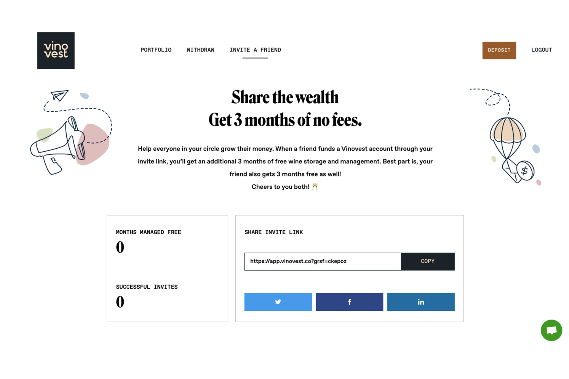
Put your growth on autopilot
GrowSurf is modern referral program software that helps product and marketing teams launch an in-product customer referral program in days, not weeks. Start your free trial today.
GrowSurf is modern referral program software that helps product and marketing teams launch in-product referral and affiliate programs in days, not weeks.
Your SaaS solution may be the best thing since sliced bread. You know deep in your gut it can make the lives of your target audience significantly better. But if you’re not generating enough leads, chances are your SaaS business won’t stick around for long. So, in this blog post, we’ll take a look into 12 stupidly, simple ways that can help you generate more SaaS leads for your business.


 Salesforce
 Stripe
 HubSpot
 Chargebee
 Recurly
 PayPal
 Tango Card
 Webhooks
 Zapier