Put your growth on autopilot
GrowSurf is modern referral program software that helps product and marketing teams launch an in-product customer referral program in days, not weeks. Start your free trial today.
Summarize with AI
The ultimate goal of any business is to increase conversions and bring in more revenue. Conversion rate optimization (CRO) is the practice of improving the percentage of website visitors who take the desired action, such as making a purchase or filling out a form. By focusing on CRO, businesses can drive more sales and leads from their existing traffic.
One way to drive more revenue is to increase your website's conversion rate. However, even if you're already converting some visitors into customers, there is likely room for improvement. The average website conversion rate across industries is only around 2-3%, meaning the vast majority of traffic doesn't convert. By optimizing your website and marketing funnel, you can turn more of those window shoppers into paying customers.
Many factors can impact website conversion rates, including design, user experience, messaging, and technical performance. Luckily, there are proven strategies you can apply across your website and marketing funnel to systematically boost conversions. This requires taking a holistic approach to conversion rate optimization that accounts for every customer touchpoint.
Let's dive in!
A conversion rate is the percentage of website visitors who complete a desired action, such as making a purchase, signing up for a newsletter, or filling out a lead form. It measures how effectively your website and marketing funnel turn traffic into customers or leads.
Conversion rates can be calculated for your website as a whole, but it's also useful to track micro-conversions like email signups, content downloads, or adding items to a cart. By optimizing for these micro-conversions, you create a smoother path to the ultimate macro-conversion of making a sale.
The conversion rate is typically expressed as a percentage of total visitors or page views. For example, a 3% conversion rate means 3 out of every 100 website visitors complete your target action.
If your conversion rate is low, it signals that there are friction points and areas for improvement in your website design, user experience, messaging, and marketing funnel. You may need to optimize elements like your website design, calls-to-action, page content, site speed, and advertising campaigns. Consistently testing and iterating based on data is key to steadily increasing conversions over time.
Conversion rates are a crucial metric for any business with an online presence. They directly impact key performance indicators like customer acquisition costs, marketing ROI, and ultimately revenue and profitability. Even small improvements in conversion rates can lead to exponential growth when compounded across your total website traffic.
Conversion rates can make or break your business and website because they measure the likelihood of a visitor becoming a customer. Studies show that conversion rates vary depending on what industry you’re in, where you live, and other factors.
To start with, focusing on bringing more traffic to an optimized website will result in a low return on investment (ROI). However, aiming to convert the traffic you already have can significantly increase your ROI.
Beyond the financial impact, conversion rates provide invaluable insights into how users interact with and experience your website and marketing campaigns. Low conversions in certain areas can reveal usability issues, messaging problems, or misalignment with customer needs and expectations. This feedback loop allows you to continually optimize the customer experience.
No matter what type of online business you operate or what industry you're in, there are proven strategies you can implement to systematically increase conversion rates over time. The key is to continually optimize based on real user data and behavior insights from tools like heatmaps, user recordings, analytics, and A/B testing.
In the following sections, we'll cover 11 proven strategies across areas like website design, user experience, content, social proof, and marketing tactics that you can implement to increase conversions for your online business.
Get this:
The average website conversion rate is 2.35%.
Some of the best websites have conversion rates of 11% or more.
Other sites have a concerningly low conversion rate of only 0.1 to 0.2%. In other words, only 1 in 1000 visitors becomes a paying customer.
So, how do you increase conversions with the traffic you already have?
The following section is all about helping you achieve that!
Social proof is a powerful psychological principle that refers to people's tendency to follow the crowd and be influenced by the actions and opinions of others. In marketing, this means highlighting customer reviews, testimonials, statistics on your customer base, media mentions, and other signals that your product or service is popular and trustworthy.
Social proof can alleviate skepticism and provide the "proof" customers need to feel confident in their purchase decision. It's an essential trust-building element for any successful conversion funnel.
Here are some proven ways to incorporate social proof throughout your website and marketing funnel:
Feature customer testimonials and video reviews on key pages like your homepage and pricing page: 92% of customers read online reviews before buying, while 72% say positive testimonials and reviews increase their trust in a business.
Showcase case studies that demonstrate your product's success for real customers : Case studies are a great way to use social proof if you're trying to show how your service or product has been implemented successfully by customers or clients.
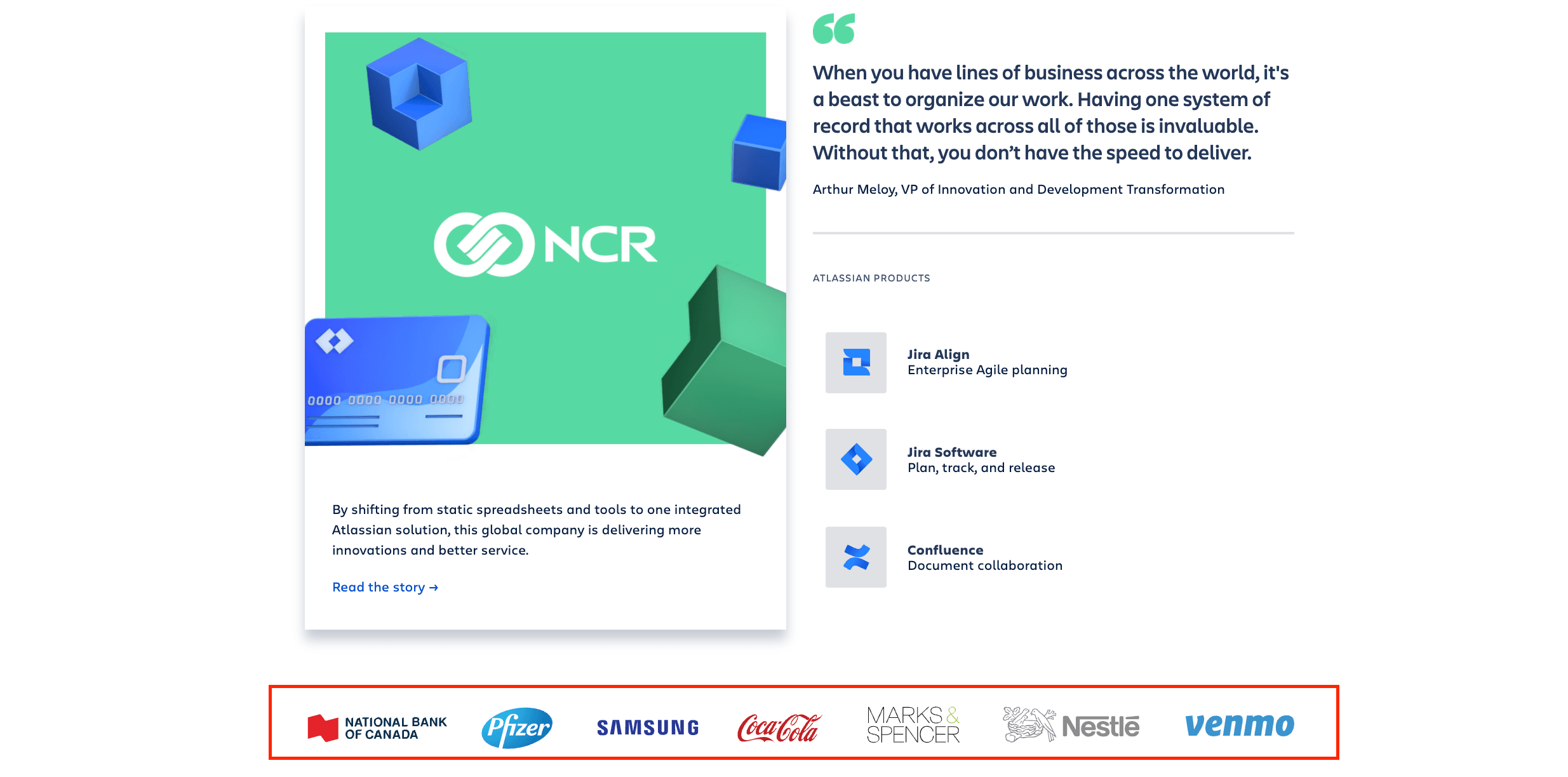
Name-drop recognizable brands you work with to convey credibility: By showing users your existing customer base, you're essentially telling them that these successful companies approve your product/service.
Share real-time stats and use numbers and statistics to quantify your customer base, e.g. "Trusted by over 10,000 businesses worldwide" : This shows that you have an established business that is trusted by thousands of people. What's more, new visitors will likely have a positive first impression of your brand – you're transparent and have nothing to hide.
Integrate reviews from third-party sites like G2 Crowd directly on your website: Prospects will look for customers that look similar to them and their use-cases. Reviews help make the connection to your product or service more clear.
Share positive media mentions: Leverage social proof like PR coverage to boost brand perception.
Display trust badges like security certifications, money-back guarantees, and awards: This can be a fantastic opportunity to win new customers who are considering and evaluating the product/service you offer.
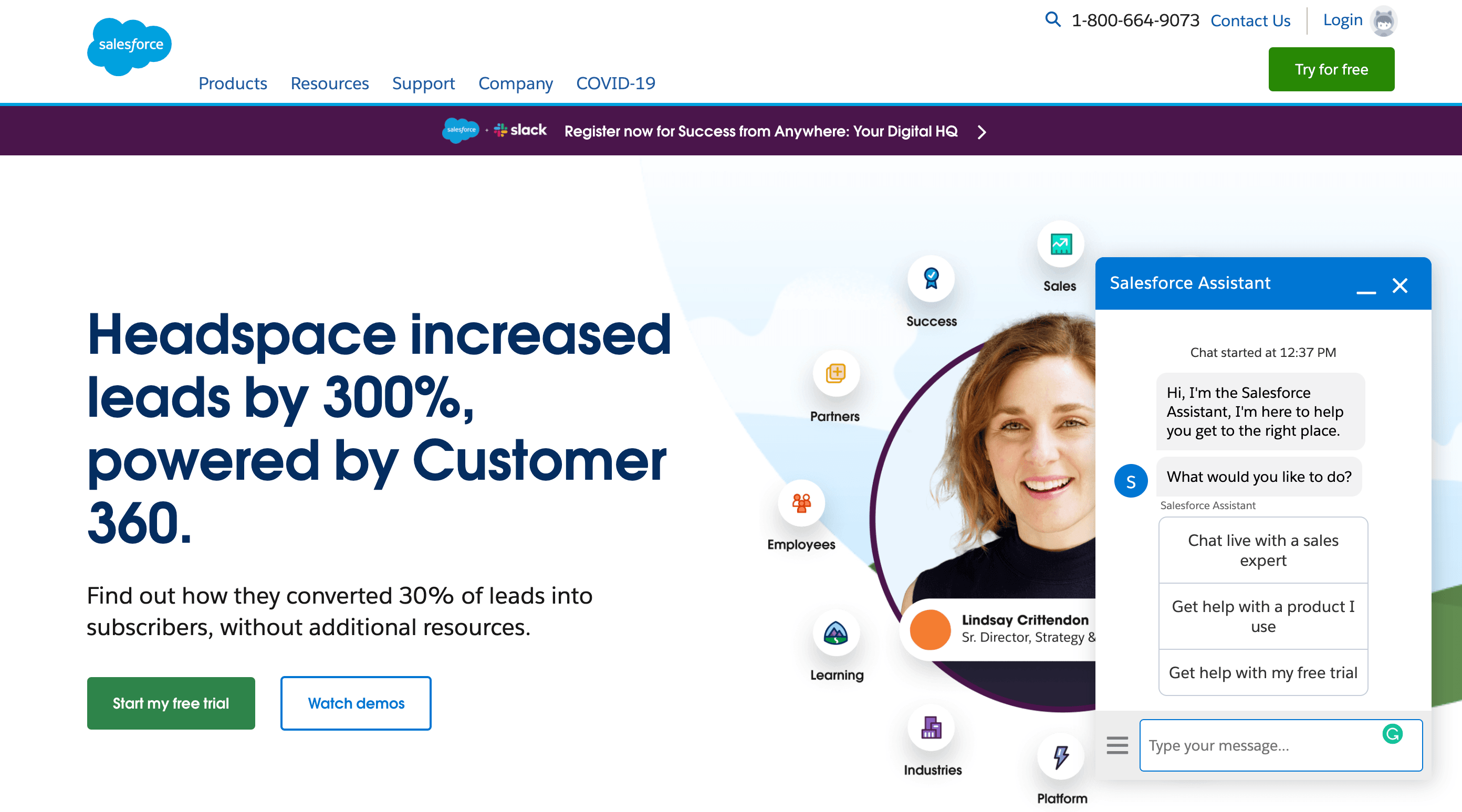
With the majority of internet traffic now coming from mobile devices, having a mobile-optimized website and marketing funnel is critical for maximizing conversions. Even if your target audience primarily uses desktop, providing a seamless cross-device experience is essential.
A poor mobile experience leads to high abandonment rates and lost sales. Signs of an under-optimized mobile site include slow load times, difficult navigation, text that doesn't fit the screen, and forms that are impossible to complete on a small touchscreen.
Here are some key areas to focus on for optimizing the mobile experience and conversions:
Live chat support has become an increasingly popular and effective way to engage website visitors and overcome conversion obstacles in the moment. When a visitor has a question or concern, being able to get an immediate response can be the nudge that moves them through your funnel.
Live chat meets the modern consumer's expectations for fast, convenient communication without the hassle of phone calls or back-and-forth emails. It provides a frictionless way to have their questions answered and objections addressed by a real human.
According to research, live chat leads to a 48% increase in revenue per chat hour and a 40% increase in conversion rate. It's an essential conversion optimization tool for any business.
Here's a fact:
Customers of the 21st century want to communicate with their favorite businesses as they do with their friends – quickly and effortlessly.
During the pandemic, live chat saw an increase of 16%, email 8%, and phone support saw no increase in demand whatsoever.
There are no waiting lines and no need to pick up the phone, which customers love. With that being said, adding a live chat is an easy and effective way to avoid losing potential customers.
Even if customers have a quick question about your product/service during odd hours, someone will be there to alleviate their concerns.
To maximize the impact of live chat, make sure it's available during your peak website traffic hours, not just standard business hours. You should also train chat agents to provide knowledgeable, friendly service that guides visitors toward conversion. Integrate chat with your CRM and have processes in place to follow up with any missed or unresolved chats.
Creating a sense of urgency and scarcity can be powerful motivators that spur prospective customers into taking action before it's too late. The fear of missing out (FOMO) is a psychological principle you can leverage through tactics like:
When done right, these urgency elements can increase a visitor's motivation to convert by making the offer seem more valuable and exclusive.
However, it's important to strike a balance and not come across as too pushy or deceptive with urgency tactics. The scarcity should be real and the countdown timers should be accurate. If visitors feel misled, it will only breed distrust and abandonment. When deployed authentically and sparingly, scarcity can give that healthy nudge toward conversion.
Beyond limited-time offers and inventory scarcity, you can create urgency through tactics like:
The key is to make customers feel that if they don't act now, they could miss out on something valuable.

Fact:
Customers don't take action unless they're challenged to take action. It's obvious to us that we need them to subscribe to our newsletter, so we just assume it's obvious for them too. It's not.
Your customers can't read your mind. You have to clearly invite them to take a journey with you or they won’t. The best way of telling them your expectations is through strong call-to-actions.
For example, "buy now" or "subscribe" buttons are great examples of calls to action. But adding one CTA won't do the trick! You should place call-to-action buttons on:
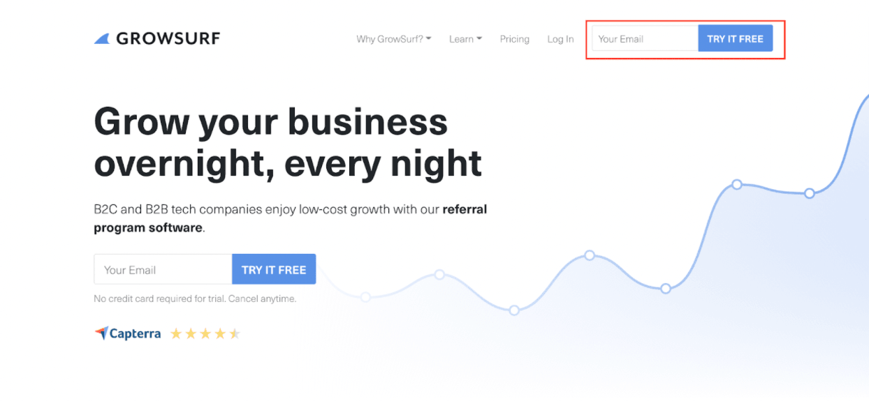
If you want to make your CTAs easier to notice, you have to make sure they stand out from the rest of the page. The best way of doing so is by using a bright color for your buttons, like orange or green. For instance, if your page is in a white color, like in the example below, using a blue color is a great way to grab attention.
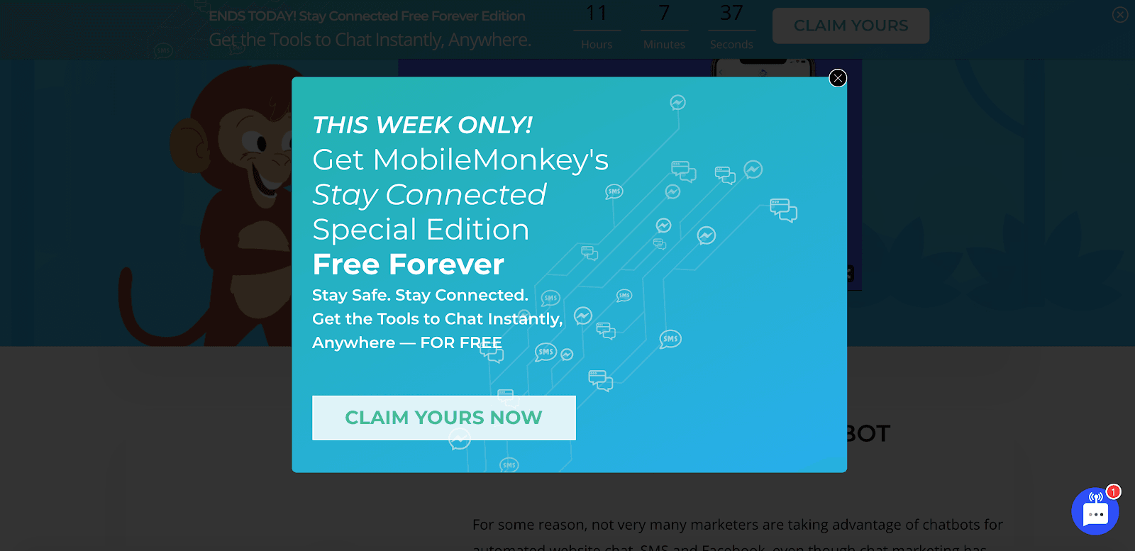
Popup email capture tools are a great way to gather new leads and nurture your existing ones. Popups can be used anywhere on the website, from the homepage to product pages.
If you're thinking about adding popups, be sure they don't disrupt the user experience. When done properly, these pop-ups are a great way to capture email addresses and build your customer database. But if they look like an obstacle, your visitors won't hesitate to leave your site.
Consider:
We all know how easier it is to focus on a task without a smartphone nearby.
It's the same when visitors are using your website. If the website feels cluttered and confuses the user with too much content, they won't hesitate to click the "exit" button.
The fact is that the human brain prefers simple, clean sites that it can quickly process and evaluate.
If you want to remove distractions, the first thing you need to do is make sure your navigation is minimalistic. For example, your menu shouldn't have 10 menu headings with a dozen subheadings.
What's more, avoid using too many colors. Your visitors should be able to read the content clearly without too many colors overwhelming their eyes. Focus on a consistent color scheme and use plenty of white space.
Other things to remove are flashing ads and using too many graphics. Not only are these different elements distracting, but they're downright frustrating.
The most crucial content on your website is your headlines and subheadings, benefits and features, testimonials and reviews, and simple branded visuals.
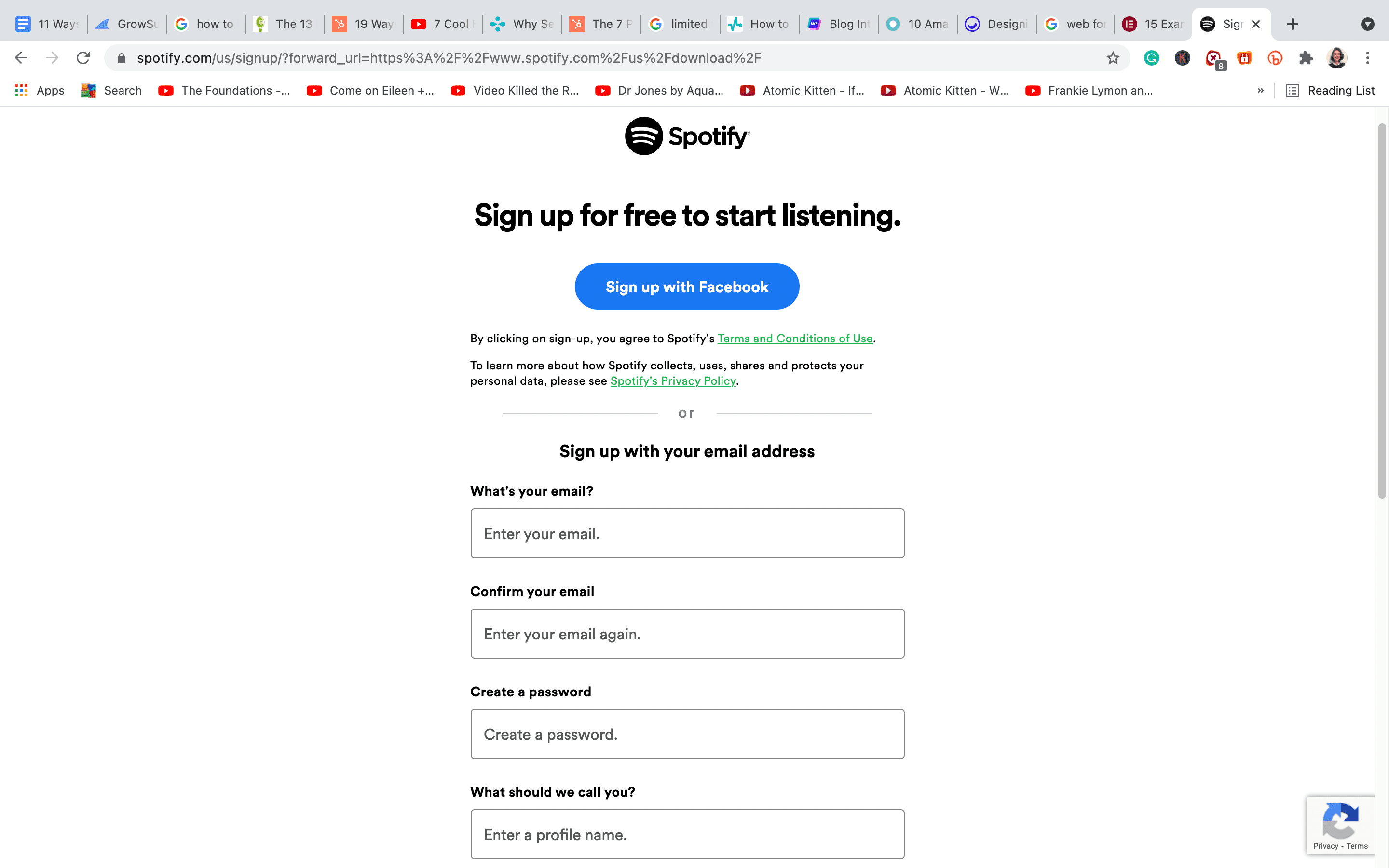
Web forms are one of the most crucial types of interaction between you and your customers. They are one of the final steps in the conversion phase and the customer's journey.
With that said, they should be easy to use and streamlined so that your visitors can quickly fill it out without much confusion.
For example, if your form is too long, visitors might drop out of the process. You must make your forms shorter and request only the necessary information from your users.
What's more, consider avoiding optional fields in your form. They take up space, negatively affect your conversion rate, and are most often left empty.
The labels need to be short, descriptive, and to the point. The user should be able to scan quickly through the label and fill in their data without pause.
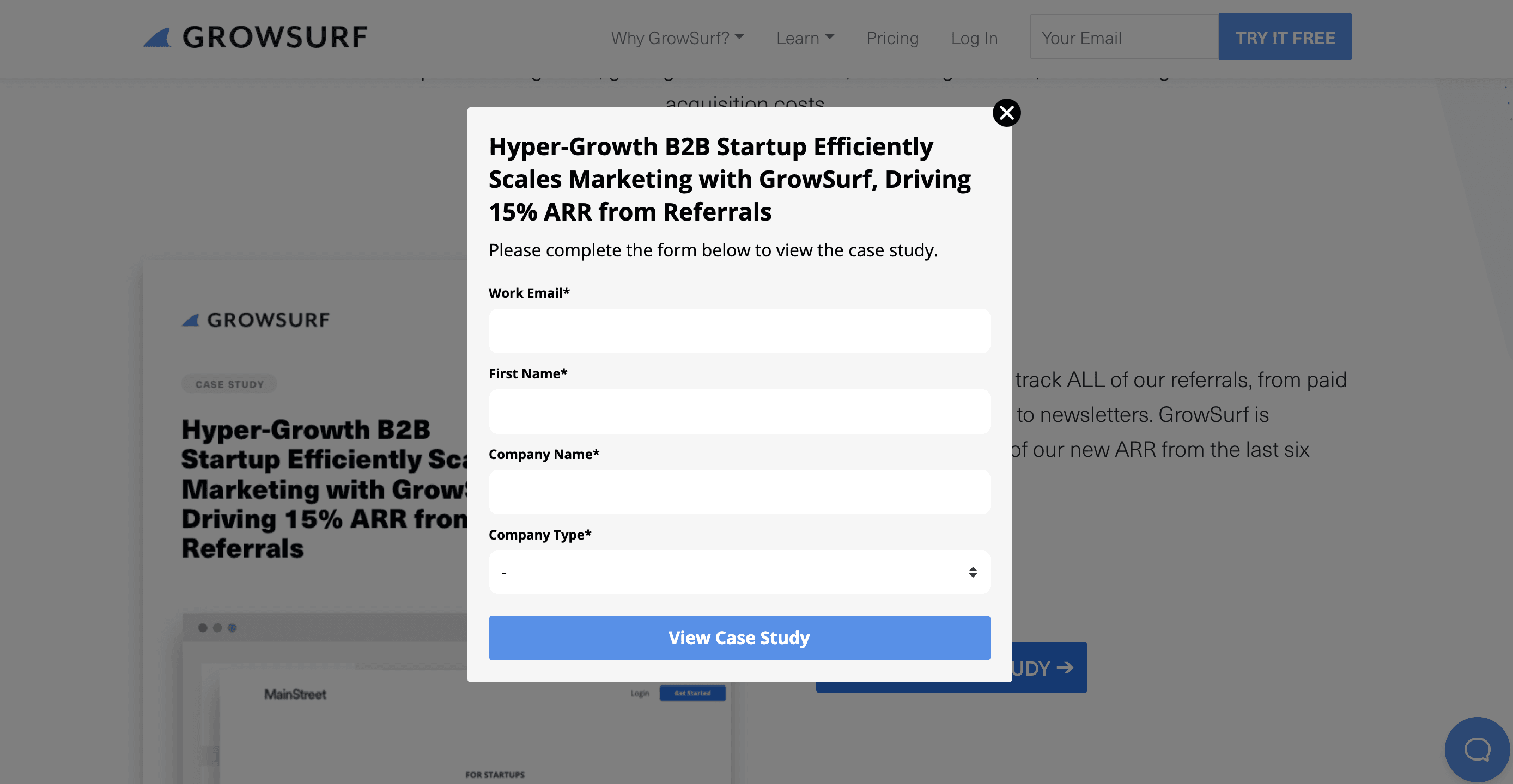
One of the best ways to generate more leads for your business is through lead magnets. Lead magnets are any kind of content, ebook, or another piece of information that your company provides to prospects in exchange for their contact information.
If you're not satisfied with your conversion rate, experiment with different lead magnets until you find something that clicks with your audience.
Here are some ideas:
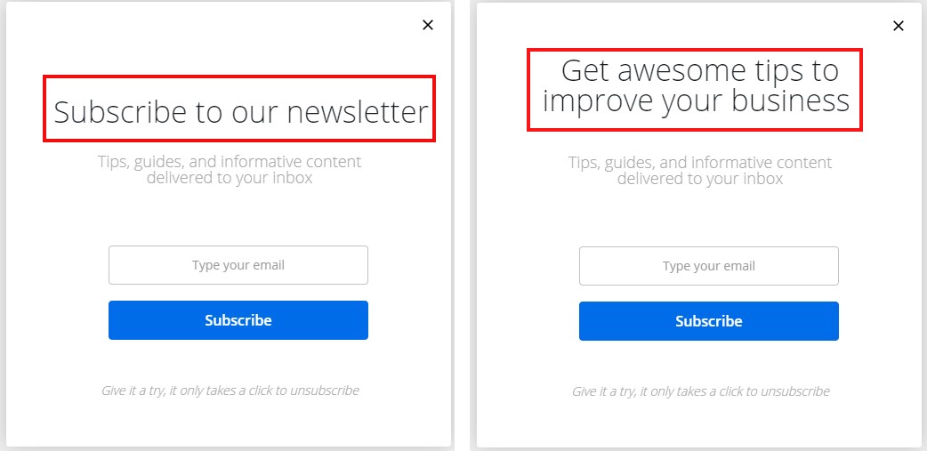
All marketers know that the headline is one of the most critical pieces of content you can create. They are so powerful that they can influence your visitors to click or to leave.
In order to ensure you're using the right headlines, a great strategy would be to conduct A/B testing.
In short, A/B testing is a process in which you show two different versions of the same content to users and collect data about which was more successful.
If you're considering A/B testing your headlines, experiment with the use of numbers and statistics, as well as with the length and tone of your lines.
If visitors feel like they can't trust your brand, they'll be less likely to make a purchase.
So, what are some strategies for increasing trust?
Some of the best techniques are money-back guarantees, removing spammy links, and making the site easy to use. Don't forget to post fresh content to help keep users on your site. Just make sure you remove any broken links because they can greatly impact your user experience.
To sum up:
Use social proof to show potential customers that others have tried and tested their products before them.
If you're not satisfied with your conversion rate, experiment with different lead magnets until you find something that clicks with your audience.
Now you're all set to start converting those hesitant visitors into eager paying customers!
GrowSurf is modern referral program software that helps product and marketing teams launch an in-product customer referral program in days, not weeks. Start your free trial today.
Brand equity is the difference between being well liked and being iconic. Building brand equity is a long, difficult process that starts with studying legends.
SaaS pricing can be one of the most challenging parts of operating a software company. Here is a breakdown of how to make a successful SaaS pricing strategy.
One good way to create a successful referral program is to look at how other people did it. Case in point: Morning Brew. Want to learn how they built an audience of 2.5 million? This blog post breaks down the Morning Brew referral program in detail!