After much consideration, you've finally selected the most suitable referral program incentive to offer to your existing customers. But simply having an enticing reward isn't enough - you also need an effective strategy to promote your referral program and get customers excited to participate.
One of the most powerful tools at your disposal is the referral email. When done right, these emails can drive significant referral traffic and customer acquisition by tapping into your base of satisfied existing customers. According to Friendbuy, "Email marketing is a highly effective way to promote your referral program to your existing customer base and get them excited to participate."
That's easy: you send out a well-designed and thought-out refer-a-friend email.
Yes, refer-a-friend emails can be an effective tool for businesses across industries, whether it's a SaaS company like ClickUp, an ecommerce brand like Elementor, or a subscription service.
But crafting an effective referral email that actually drives results is easier said than done. According to ReferralRock, "A good referral email should have a clear explanation of your program and next step. Ensure the subject line is catchy and concise, and the offer is attractive enough to encourage participation."
In this post, you'll:
Learn how to put together an effective refer-a-friend email
See examples of some great referral emails tech companies like to use
Let's get started!
What is a Refer-a-Friend Email?
A refer-a-friend email is a targeted marketing communication that businesses send to their existing customer base to promote their referral program. These emails serve two key purposes:
Inform customers about the referral program, including details like rewards, terms, and how to participate.
Encourage customers to actually refer friends and family by providing clear next steps and an enticing incentive.
As ReferralRock explains, "Referral emails are a fixture in any successful referral program. They are direct, personal, and a great way to establish lasting relationships with your most loyal customers."
Generally, these emails let customers know what type of reward they'll get in exchange for referring the brand to their friends and family. They can also include any conditions the customer should be aware of, call-to-actions, and enticing visuals.
In short, refer-a-friend emails are the perfect way for your company to:
Engage your customers as well as reach out to new prospects.
Retain your current customers, giving them the incentive of getting something in return for their referral.
Get a wealth of data about your open rate, click rate, etc.
Now bear with me as we go through the top three tips for how to craft your perfect refer-a-friend email.
3 Tips for How to Put Together an Effective Refer-a-Friend Email
Craft an Enticing Subject Line to Boost Open Rates
The subject line is the first thing recipients see when your referral email lands in their inbox. It's a make-or-break factor that determines whether they'll open and engage with your message or simply ignore it.
According to CampaignMonitor, "47% of email recipients open an email based on the subject line alone." Failing to craft an enticing, click-worthy subject line can result in abysmal open rates, rendering your referral email efforts ineffective.
Let's look at two examples:
Example #1: WE HAVE GREAT NEWS! 🥳🥳🥳🥳🥳
Example #2: Stephanie, $30 for you, 30% off for your friends
Which example got your attention?
It's the second one, you guessed well. It's short, it's on-point, and there's a number that attracts your attention. Plus, it's got that personal element. The first one is plain, and the emojis and all caps make it look spammy.
Take a look at some additional best practices to craft the best referral email subject line:
Use a familiar sender name: Emails from recognized companies or contacts are much more likely to get opened. Use your business name or a personal name customers will recognize.
Convey a sense of urgency: Creating a fear of missing out can motivate opens. Use words like "limited," "today only," or mention an expiration date.
Ask a question: Questions pique curiosity and can compel opens to find the answer inside the email.
Mention the referral incentive: If you're offering a compelling reward like cash or discounts, highlight it in the subject line.
Keep it short. A good headline should be clear and to the point. You want it to draw people's attention, but you don't need it to go on forever. Use no more than nine words or 60 characters.
Use numbers. Numbers are a good-old tactic for triggering people to read your content. By using a number in the headline, you're instantly hooking the reader's interest.
Use power words. They can trigger a psychological or emotional response, making them a fantastic way to get people's attention.
Add some emojis. Adding one or two emojis can add a playful element to your subject line. But make sure you don't overuse them, just like in the example above. If you do it right, you can increase your open rate by 29%, as some studies have found.
Personalize your subject lines. Consider including the recipient's name in the subject line. Personalization is shown to increase open rates for most users. In fact, a study has found that personalized subject lines have 29% higher open rates than non-personalized subject lines.
Include the basics of your referral program
I don't know if I've mentioned this enough, but here it goes again:
People's attention spans are shrinking by the minute – and we have the information age to blame.
Chances are you're struggling to remain focused while reading this article.
In other words, if your customers took the time to open your email, they'd want to know all the main facts right away – no muss, no fuss.
Inform them why you're sending an email (to invite them to join your referral program) and what you're offering in return (your referral program incentive).
It might be a good strategy to offer more details about the referral program, such as:
Is it a one-sided program where only the referrer receives a reward, or is it a two-sided program where both the referrer and the referee are rewarded?
How long will the offer stand? Is it a one-time referral, one-month referral, or an ongoing referral program?
Is it a tiered program? Does the referrer's reward increase with each referral?
Keep in mind that the goal of the refer-a-friend email is to convince your customer to join your referral program – nothing more, nothing less.
Your customers may have some questions, but you can always create a referral program landing page to give further information.
Write a clear call-to-action
You succeeded in capturing the customer's attention, and now it's time to convince them to spread the good word.
When it comes to CTAs in a refer-a-friend email, you have two options:
Take the customer to a different page once they click on the CTA button with more details about how the program works.
Give the customer a unique referral code to send to their friends and family right from the email.
Regardless of whether you go with the first or second option, a CTA is a critical component that leads the customer to the next step in the process.
Here are some tips for creating email CTAs that your readers can’t help but click:
Pay attention to visual cues. Make sure your button stands out by using white space effectively and contrasts the colors on the rest of the page. If necessary, frame the button to increase the contrast. Make the CTA button large enough to be seen but not overwhelming.
Place it above the fold. Customers shouldn't scroll down on the page to find the CTA button. Instead, it should be one of the first things they see. For that reason, you should place it above the fold where it's visible and makes sense. Adding more than one CTA button is also a common practice, especially if your email is longer.
Keep it short. Two or three words is best but no more than five or six.
Be sure to use actionable words to compel the customer to click. They're called calls to action, after all. You may want to avoid overused words like "enter," "click here," or "submit." Instead, opt for calls to action like "refer your friends," "share your unique referral link," "invite friends and get 20%," etc.
Create a sense of urgency. Even a tiny thing like adding the word "now" can increase your conversion rate. For example, you can say "join now" or "get 20% off this weekend only."
Additional Best Practices for Crafting Effective Referral Emails
Beyond the core elements like subject lines, incentives, and CTAs, there are several other tactics that can elevate the performance of your referral emails:
Use eye-catching visuals: Incorporate branded product images, GIFs, or graphics that grab attention and reinforce your referral offer. As CampaignMonitor notes, "The human brain processes visuals 60,000 times faster than text." Visuals help quickly convey the value proposition and benefits of your referral program.
Personalize the referral email. Here's another refer-a-friend marketing idea: Go beyond just using the recipient's name - personalize the content, messaging, and offers based on their interests, purchase history, and engagement. According to Invesp, "Personalized promotional emails have 29% higher unique open rates and 41% higher unique click rates than non-personalized promotional emails."
Streamline the referral process. Reduce friction by allowing customers to easily refer friends directly from the email itself. Include their unique referral link or code that can be copied and shared, without requiring extra steps. As ReferralRock advises, "If a customer has to jump from one page to another just to send a referral, they'll likely get frustrated and give up."
11 Examples of Referral Email Designs to Get You Inspired
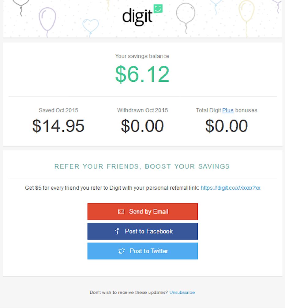
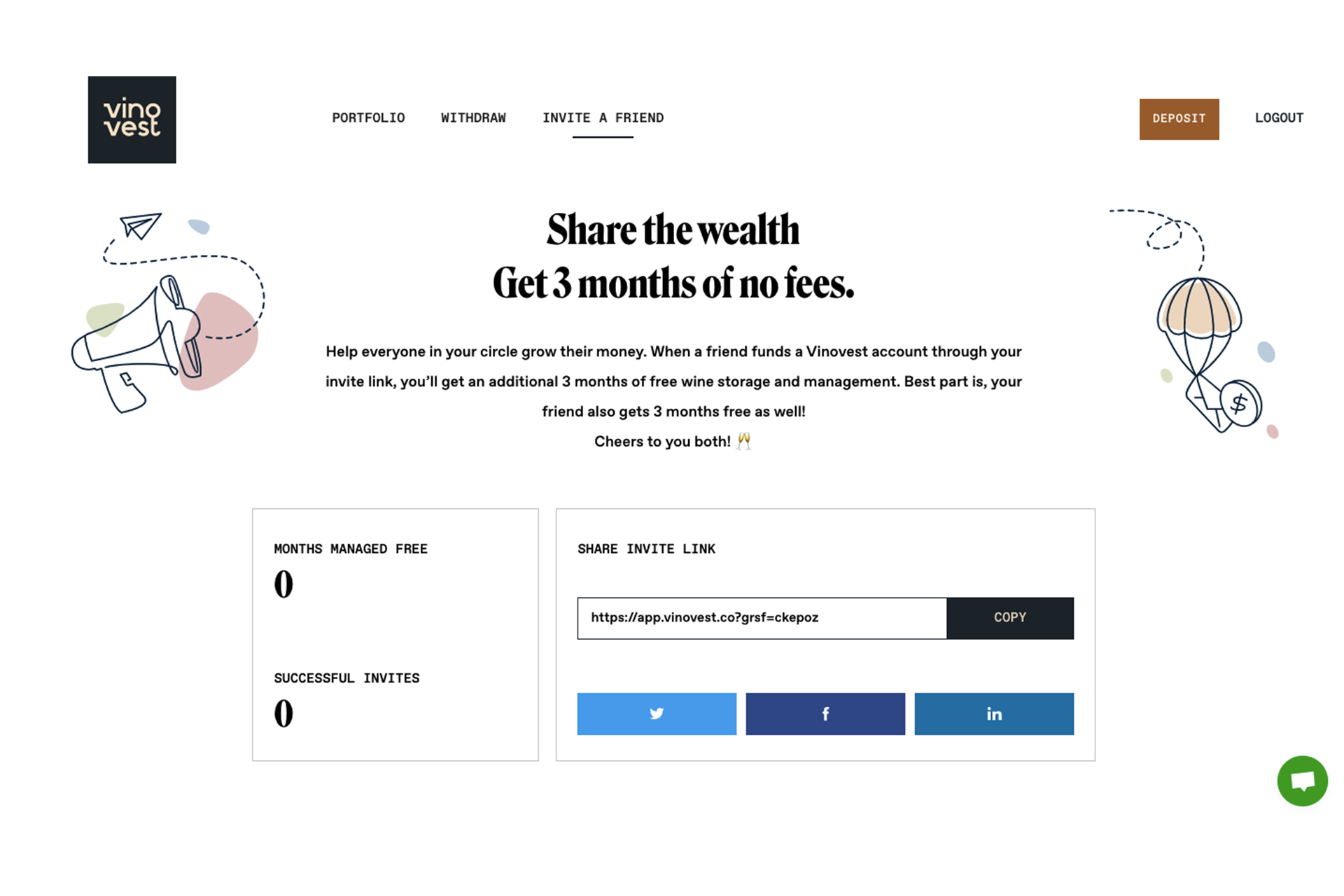
Digit (B2C)
Digit is an app that automates your finances. In short, it tracks what comes in and out of your bank to determine how much you can save. What's more, it moves small amounts each day to help you reach your short and long-term savings goals.
Why we like this refer-a-friend email example:
It has a clear call-to-action "refer your friends, boost your savings" that tempts people to take action.
It gives people the option to invite friends through a unique referral link, email, Facebook, or Twitter.
It lets people know it's a one-sided referral program where the referrer gets $5 for every friend they refer.
The email features an account update, where customers can see how much money the app has helped them save, which can motivate them to keep using the app.
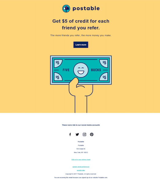
Postable (B2C)
Postable is a card service app that makes sending snail mail as easy as sending an email. People can choose to send cards for all kinds of occasions, including graduation, birthdays, and weddings. Postable will print, stuff, stamp, address, and mail all of your cards directly to everyone for you.
Why we like this refer-a-friend email example:
The short headline tells the customer exactly what they're going to get for referring a friend ($5 for each referral).
A simple call-to-action takes the customer to a different page that explains the referral program in more detail.
The GIF is visually appealing and fun. It also shows customers what they're getting.
Their choice of yellow color is very impactful – it increases cheerfulness and warmth.
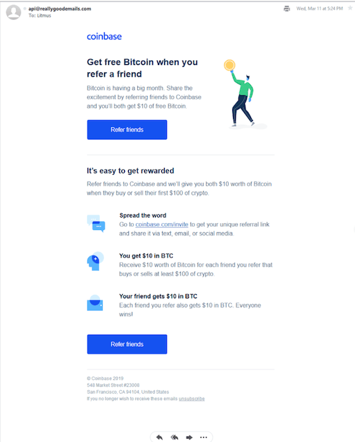
Coinbase (B2C)
Coinbase is an app that makes it easy to buy and sell cryptocurrency. It's the largest cryptocurrency trading platform in the U.S. It lets users trade more than 50 cryptocurrencies, including bitcoin, ethereum, and litecoin.
Why we like this refer-a-friend email example:
The headline really catches your attention. For every referral, Coinbase will give customers a free coin. That seems like a great opportunity customers wouldn't want to miss.
The short text beneath the headline further explains how the referral program works. It tells customers that it's a two-sided program where both parties get $10 of free Bitcoin.
The first call-to-action button is right above the fold, nicely designed in blue, so it contrasts the rest of the page. There's a second CTA at the end of the email.
The email also explains the referral process by breaking it down into three simple steps, with attractive icons and readable copy.
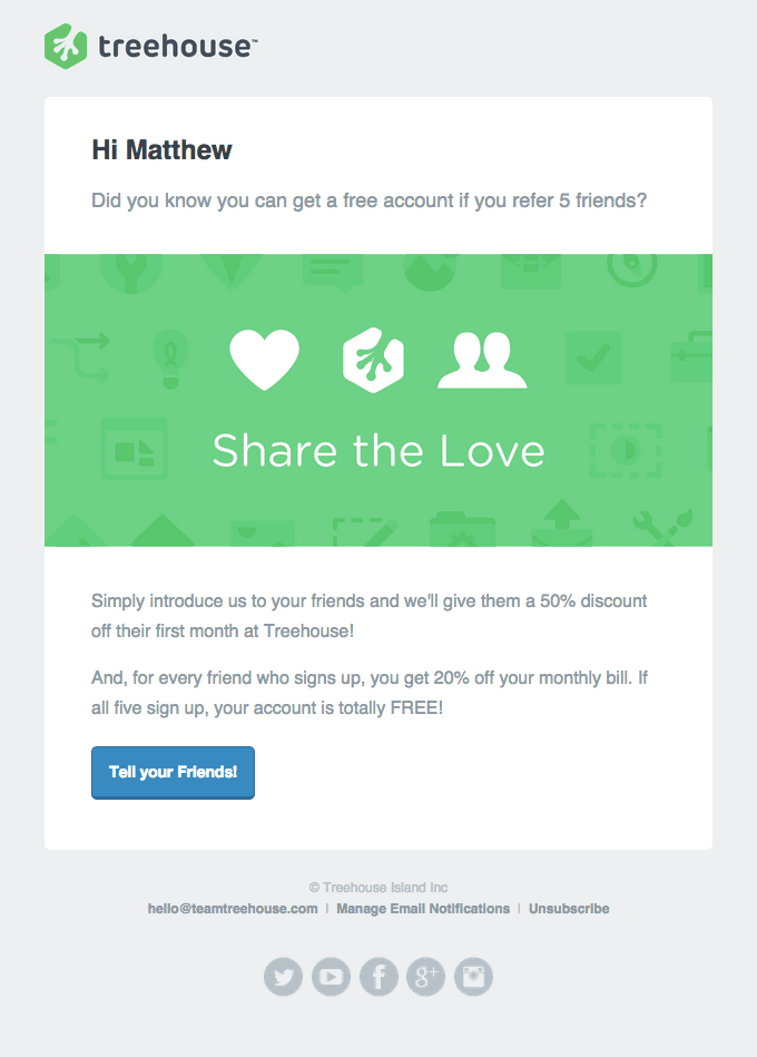
Treehouse (B2C)
Treehouse is an e-learning technology platform that offers online courses and workshops in tech-related subjects like web design, web development, and mobile development.
Why we like this refer-a-friend email example:
It contains a personal greeting element ("Hi Matthew") which dramatically improves customer experience and makes it more likely for the customer to read the email.
It starts the email with a question, "Did you know you can get a free account if you refer 5 friends," which engages the customer.
A powerful "share the love" copy that can make customers feel good about themselves.
It introduces a tiered referral program where the referrer gets 20% off for every friend who joins. If five friends join, the referrer's account will be totally free. The referees also get a 50% discount.
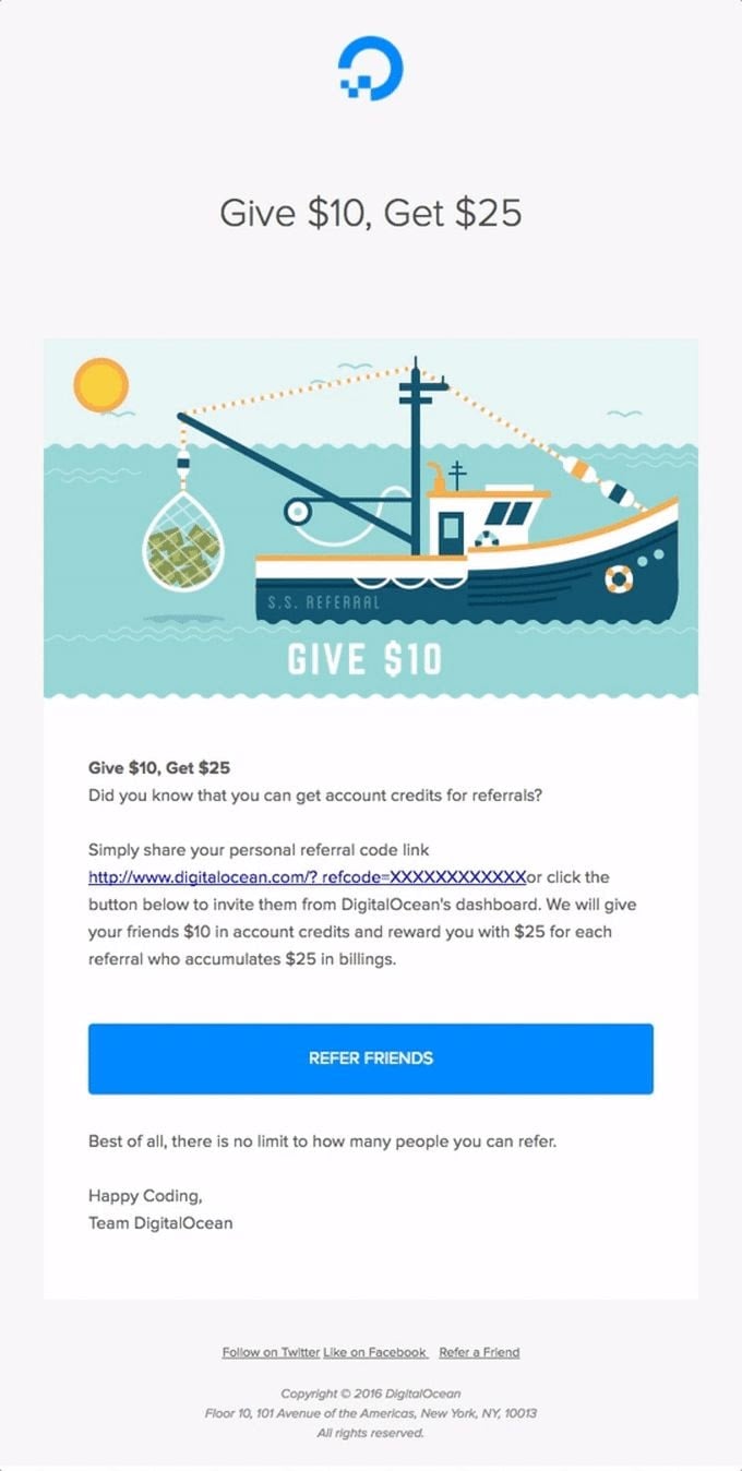
Digital Ocean (B2C)
Digital Ocean is a professional cloud hosting provider geared towards advanced users, offering a myriad of customizable and combinable options.
Why we like this refer-a-friend email example:
The headline clearly explains the double-sided referral reward (the referrer gives $10 to the referee and gets $25 in return).
The email includes an ocean-themed GIF (Digital Ocean – get it?) that's consistent with the brand and further highlights what the customer will get.
Customers are left with a choice: they can either share their unique referral link or click the CTA button to invite their friends from Digital Ocean's dashboard.
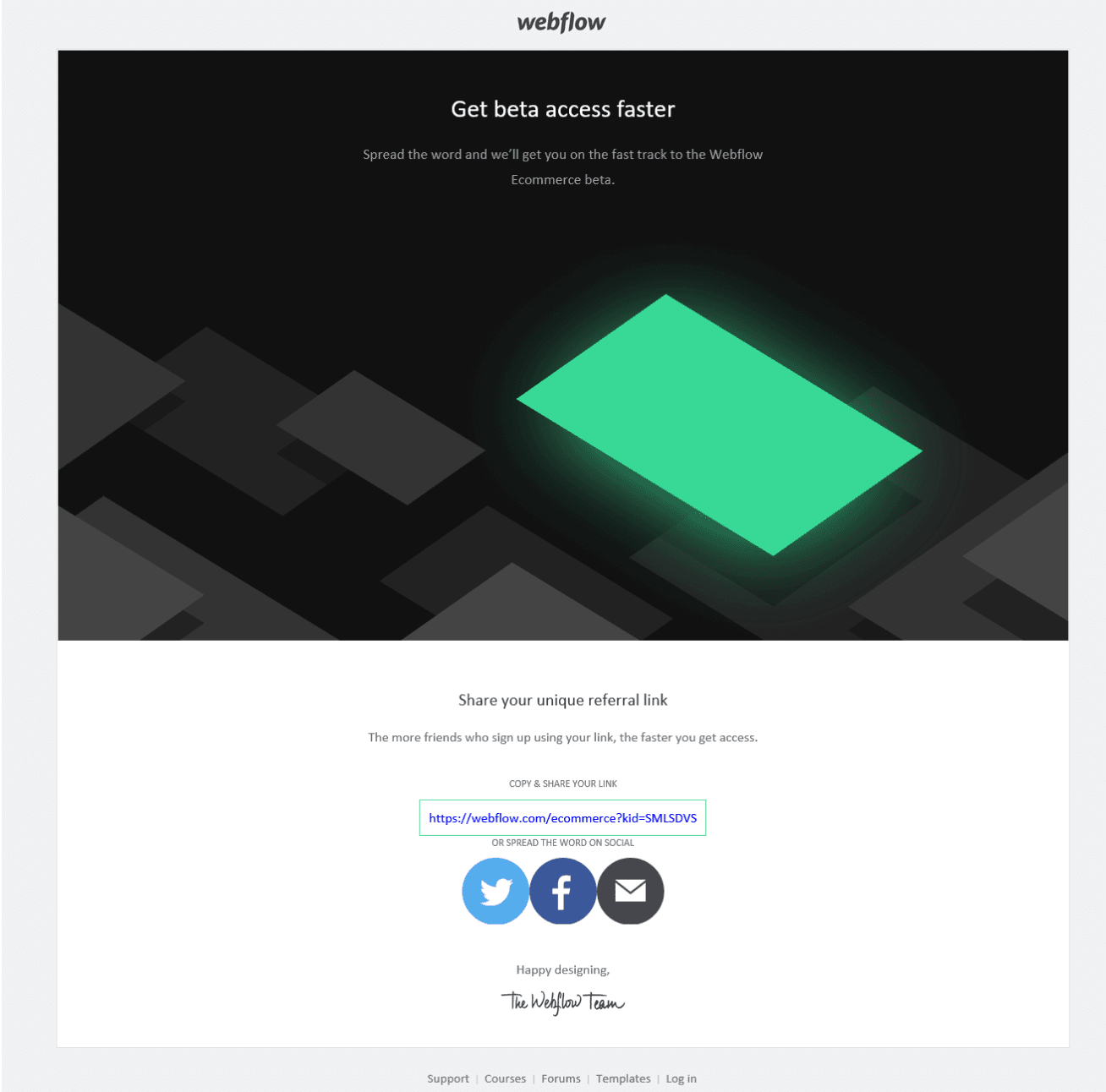
Webflow (B2B and B2C)
Webflow is a website builder that lets designers build professional, custom websites in a completely visual canvas with no code.
Why we like this refer-a-friend email example:
The referral email gets right to the point with an enticing offer ("get beta access faster").
The referral program incentive is very tempting (beta access for people who refer the most friends). Even better, it's a milestone incentive, meaning the more people the customer refers, the faster they will get access.
Giving early access to customers is a great strategy that has helped companies gain new users fast.
The customer's unique referral link is included in the email, which they can simply copy and paste. Social sharing is also possible from within the email.
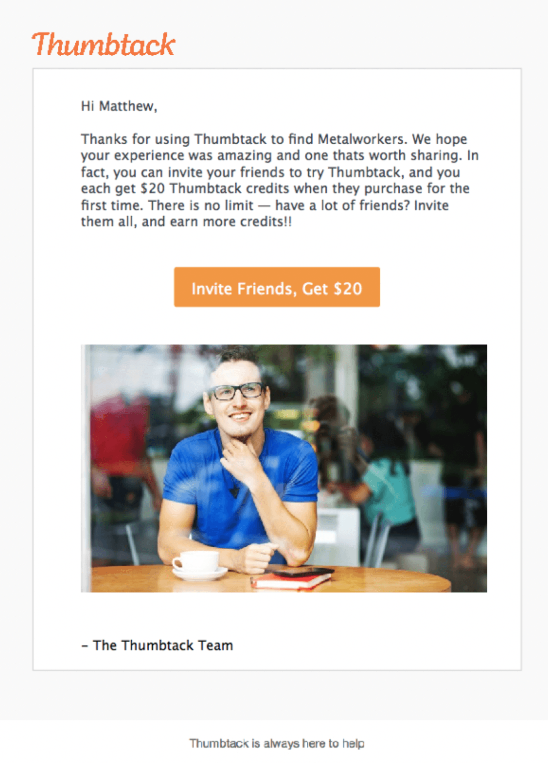
Thumbtack (B2B and B2C)
Thumbtack is an online marketplace that connects local professionals with people who need their services for projects.
Why we like this refer-a-friend email example:
It contains a personal greeting element ("Hi Matthew") which greatly improves customer experience and engages the customer.
The email copy is on-point and clearly explains the benefits and conditions of the referral program – all in a fun and engaging way.
The CTA button contrasts the rest of the page, making it impossible for the customer not to notice it.
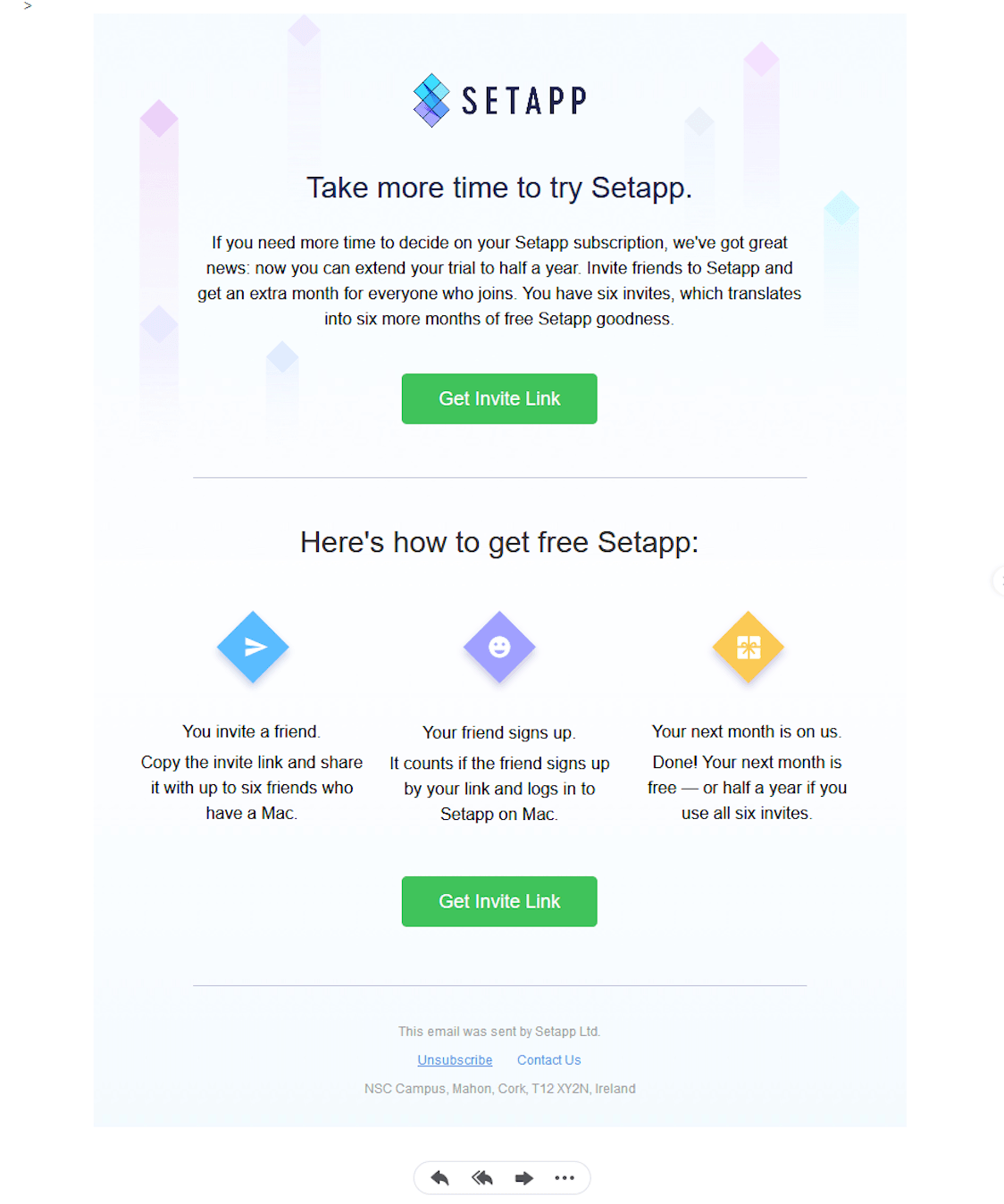
Setapp (B2C)
Setapp is a subscription-based service app that provides access to curated Mac and iOS apps.
Why we like this refer-a-friend email example:
A fantastic thing about this email is the timing. The company smartly sends the email to the customer while they're in the middle of their trial period. By simply referring their friends to Setapp, the referrer can extend their free trial to half a year.
The copy of the email clearly explains the conditions of the referral program, which is a limit of six referrals that can get the referrer six months of Setapp.
The CTA button is placed above the fold, making it incredibly easy for the customer to see it and take action. It also nicely contrasts the rest of the page. There's a second CTA button at the bottom of the page.
There's a short text below the fold that further explains how the referral program works. It features cool icons and easy-to-follow guidelines.
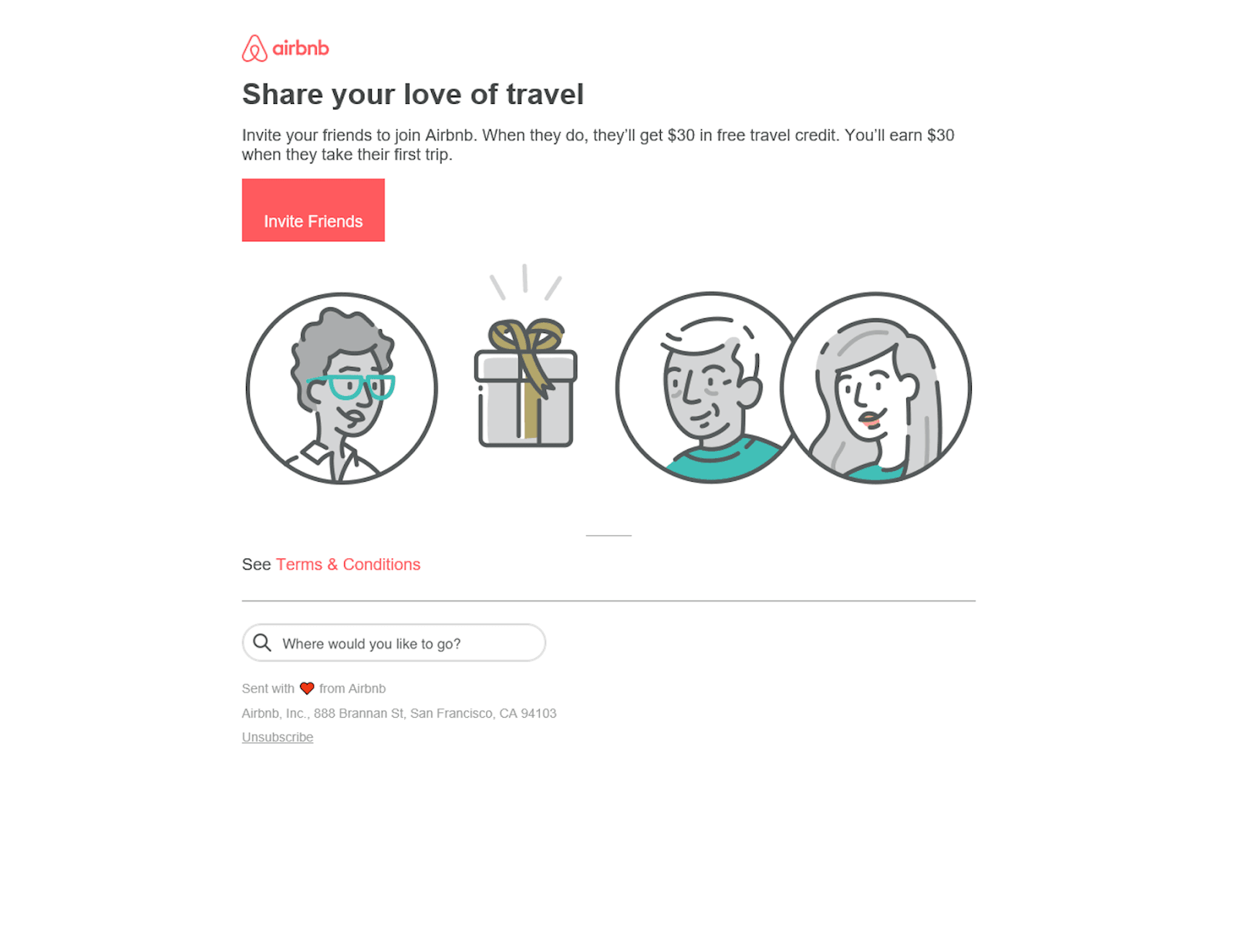
Airbnb (B2C)
Airbnb is an online marketplace connecting people who want to rent out their homes with people who want to rent a place in a specific area.
Why we like this refer-a-friend email example:
The headline appeals to customers by inviting them to share their love of travel (intrinsic reward).
By using three short sentences, Airbnb gives all the details the customers should know about the referral program.
It's a simple reward system where the referrer earns $30 when the referee makes their first trip. The email informs the customer that it's a two-sided program where their friend also receives a reward ($30 in free travel credit).
The CTA button is on-brand and in contrast with the rest of the elements.
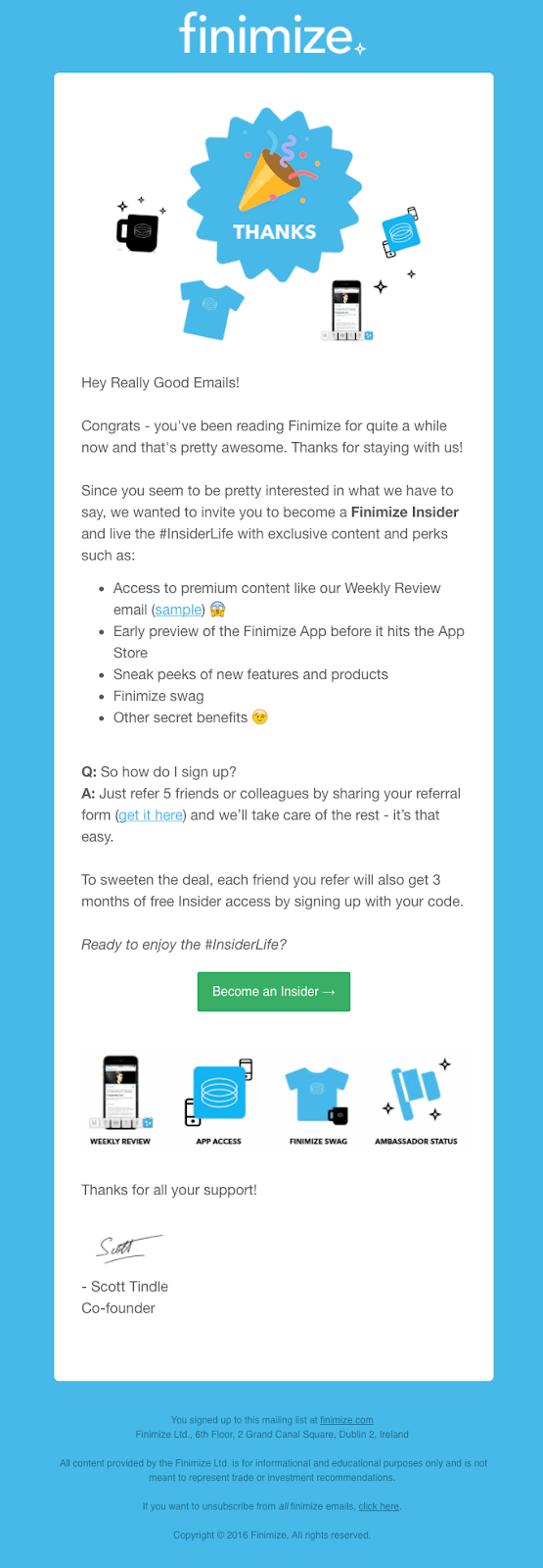
Finimize (B2C)
Finimize is an app that aims to help users become financially literate. It connects them with opinions and financial news to make smarter investing decisions and help secure their long-term financial future.
Why we like this refer-a-friend email example:
The company starts the email by thanking the user for being a loyal reader.
The email is personal, speaking to the reader directly as if the reader is their friend. This approach can make the reader feel more valued, and it also builds trust and assurance.
What's more, the email lists all the referral program incentives the reader can win by joining the program. Even better, there's a myriad of impressive rewards, from access to premium content to brand swag.
The email doesn't leave the reader wondering what they're supposed to do. It clearly explains the conditions of the referral program, and readers can easily get their referral form by following the link in the email.
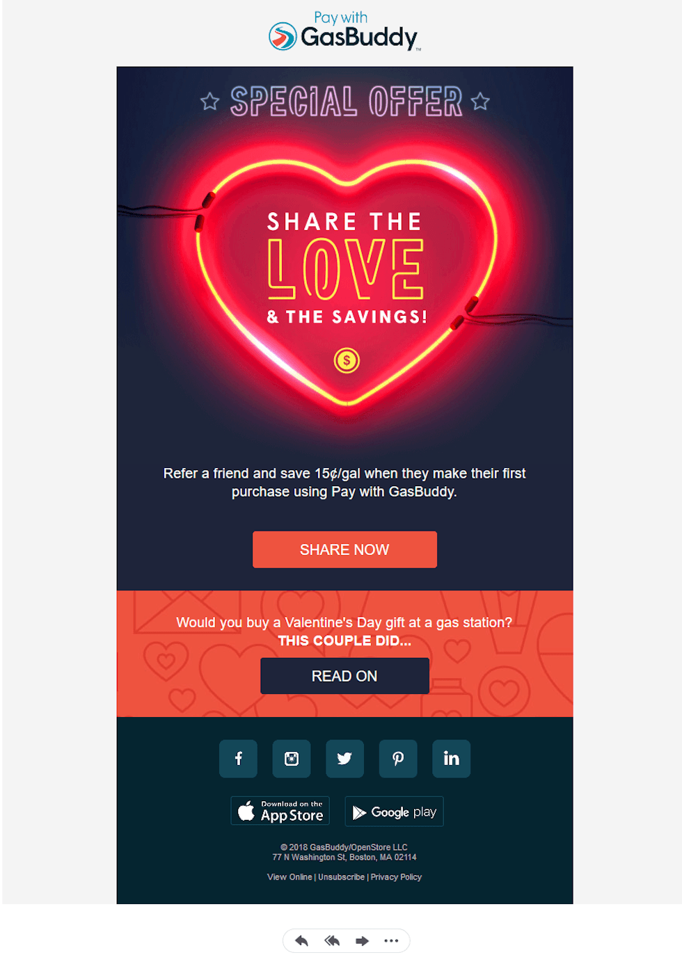
GasBuddy (B2C)
GasBuddy is a gas price app that lets you find and report gas prices.
Why we like this refer-a-friend email example:
The email catches the eye with a playful GIF that features a neon heart light. Inside the heart, there's a catchy copy that reads, "share the love & the savings."
The "Special Offer" headline is as clear as it gets.
It contains two enticing call-to-action buttons: "Share now" and "Read on."
Key Takeaways for Crafting Successful Referral Emails
To maximize the effectiveness of your refer-a-friend emails and drive more customer referrals, keep these key principles in mind:
Craft an attention-grabbing subject line that creates a sense of urgency, personalizes the message, and hints at the referral incentive.
Clearly explain the referral basics like how to participate, rewards offered, and any terms - but avoid overwhelming with too many details upfront. Provide a clear and prominent call-to-action that makes it easy for recipients to start referring friends, whether through a dedicated landing page or by sharing their unique referral link/code.
Enhance with visuals, personalization, and urgency to capture attention and motivate immediate action.
By following these referral email best practices, you'll be better positioned to tap into your existing customer base as a powerful acquisition channel.
Ready to take the next step? GrowSurf makes it easy for B2B and B2C tech companies to get started with a referral program, and the first 14 days are free!
Put your growth on autopilot
GrowSurf is modern referral program software that helps product and marketing teams launch an in-product customer referral program in days, not weeks. Start your free trial today.
GrowSurf is modern referral program software that helps product and marketing teams launch in-product referral and affiliate programs in days, not weeks.


 Salesforce
 Stripe
 HubSpot
 Chargebee
 Recurly
 PayPal
 Tango Card
 Webhooks
 Zapier