Put your growth on autopilot
GrowSurf is modern referral program software that helps product and marketing teams launch an in-product customer referral program in days, not weeks. Start your free trial today.
For some marketers, a thank you page is a great way to express gratitude to your visitors for downloading content or subscribing to your newsletter.
For the savviest marketers, a thank you page is a goldmine of opportunities to maximize your conversion rate and boost sales.
In this post, we'll talk about the most effective elements of a high-performing thank you page. We'll also look at seven examples of highly effective thank you pages and talk about what makes each of them so great.
Let's dive in!
To explain it briefly, a thank you page is a web page on your site that visitors are redirected to after they successfully submit their information in your opt-in form.
Generally, all good thank you pages contain two crucial elements:
These pages hold the power to bring you countless conversion opportunities and even increase your revenue if done right.
In this section, we're going to take a look at some elements that can be included in your thank you page if you want to scale up your conversion rate.
However, you must remember that every company is different. What works for one brand may not work for another. Be ready to test a few different versions of your thank you page to learn what triggers your target audience.

Here's a fact:
Most marketing tactics require a hefty budget. But there's one marketing strategy that is both super effective and affordable: refer-a-friend programs.
Studies show that referral marketing can increase conversion rates by up to 70%. Referral programs help you foster relationships with customers and motivate word-of-mouth.
With that in mind, if you already have a ready-and-working refer-a-friend program, why not include it on your thank you page?
Think about it for a second: your visitors are already interested and interacting with your website. They may be more than happy to refer your brand to their friends and family.
Here's another idea:
Social media buttons are a great alternative if your audience is more likely to share something on social media than refer your brand to a friend.
Doing so will encourage leads to share the word about their recent conversion – whether it's a download, purchase, or registration for an event.
Additionally, consider asking your leads to follow your company on your social platforms to engage them further.
In the world of marketing, social proof applies to reading reviews and listening to other people's recommendations before purchasing.
If a large number of people have used a service ("More than 500,000 people trust our services") or purchased a product ("Over 50,000 products sold"), then other people will follow the actions of others and become customers themselves.
Businesses use social proof as a powerful marketing tool to show potential customers that others have tried and tested their service/product before them.
But did you know that you can use this tactic in your thank you pages, too?
In fact, the savviest brands include social proof across all of their marketing channels.
One way of demonstrating authority on your thank you page is by displaying the logos or popular companies you have worked with or media outlets that have featured you in their posts. Customer testimonials are also a great way to show new leads that your service/product has been tried and tested by others before them.
If your product is a software or some kind of service, offering a sales call or a free product demo is an amazing way to nurture leads and ultimately convert them. They've already converted once by signing up for your newsletter or downloading free content, so now's the time to jump in with an offer they can't refuse. They might be ready to engage with your brand beyond just attending webinars or reading your ebooks.
Do you want to understand your buyer's needs in more detail so that you can modify your marketing efforts accordingly?
If yes, consider adding a short survey on your thank you page. It doesn't have to contain 100+ questions. A few questions asking about your target audience's goals and struggles will suffice.
If a lead has performed some kind of a desired action on your site, it means they got some value from your content.
Why not continue to educate your leads by including links to relevant blogs, ebooks, or guides?
Some businesses opt to have their most popular blogs linked based on social shares and comments. Others link to ebooks they believe can solve a particular problem their audience has.
But here's the thing: linking to additional resources doesn't only benefit the reader – it can benefit your business, too.
How come?
You'll get an opportunity to improve the online rankings of your content. Although there's no guarantee it will work, it might give your content the kick it needs to be displayed higher in search results. That's a win-win situation!
We'll take a look at each of these tactics in real-time below.
Now it's time to look at seven winning thank you page examples that follow some of the best practices we've mentioned above.
Don't get me wrong. I'm not saying you should copy-paste these examples. Let them serve you as an inspiration to create equally effective thank you pages that will boost your conversion rate.
Let's begin!
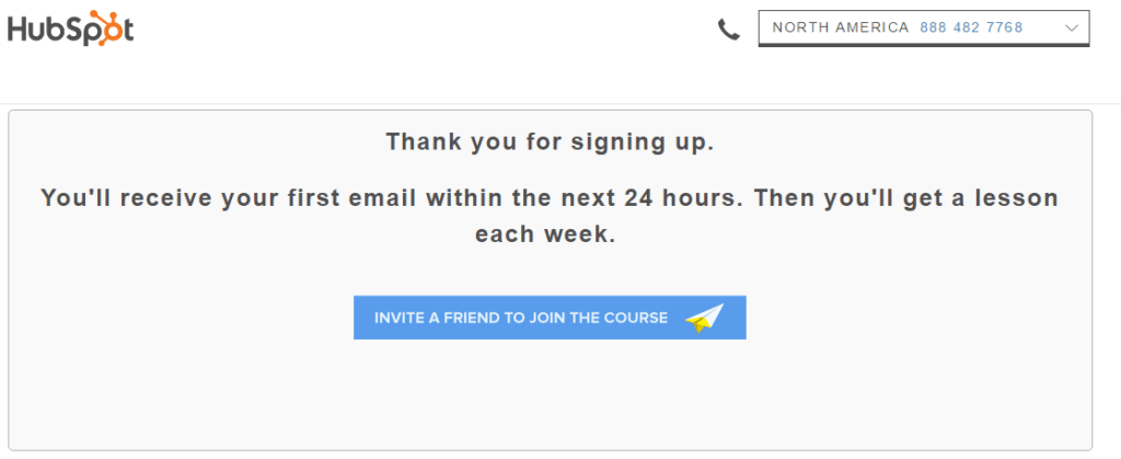
This is one of Hubspot's thank you pages for successfully signing up for their free email marketing course.
After signing up for the course, leads are directed to this page that gives them clear information about when they will receive their first lesson and how often they'll get the link to a new one. We love this thank you page because it creates anticipation among subscribers: they'll be eagerly waiting to receive their new lesson each week.
But we also love this page for something else.
If you look at the bottom of the page, you'll notice a CTA button that says:
Invite a friend to join the course.
What HubSpot does is they're trying to promote the free course by asking subscribers to refer the course to their friends. This is a great tactic as subscribers are already engaged with your brand and are more likely to share the good word.
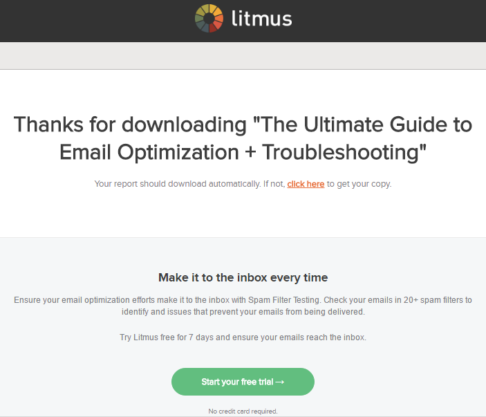
Litmus is the next company on our list of must-see thank you page examples.
Upon first look, their thank you page looks nothing different than other nicely designed thank you pages where you show your gratitude for leads submitting their information in your opt-in form, in this case, a free guide.
But if you look more closely, you can see how the company uses the opportunity to try to sell their main product: their email testing software.
And they do so by asking subscribers to sign up for their 7-day free trial. What's more, no credit card is required, which may convince hesitant subscribers to take the software for a spin.
You can see a very well-written value proposition in the grey box, which talks about the benefits of using spam filter testing.
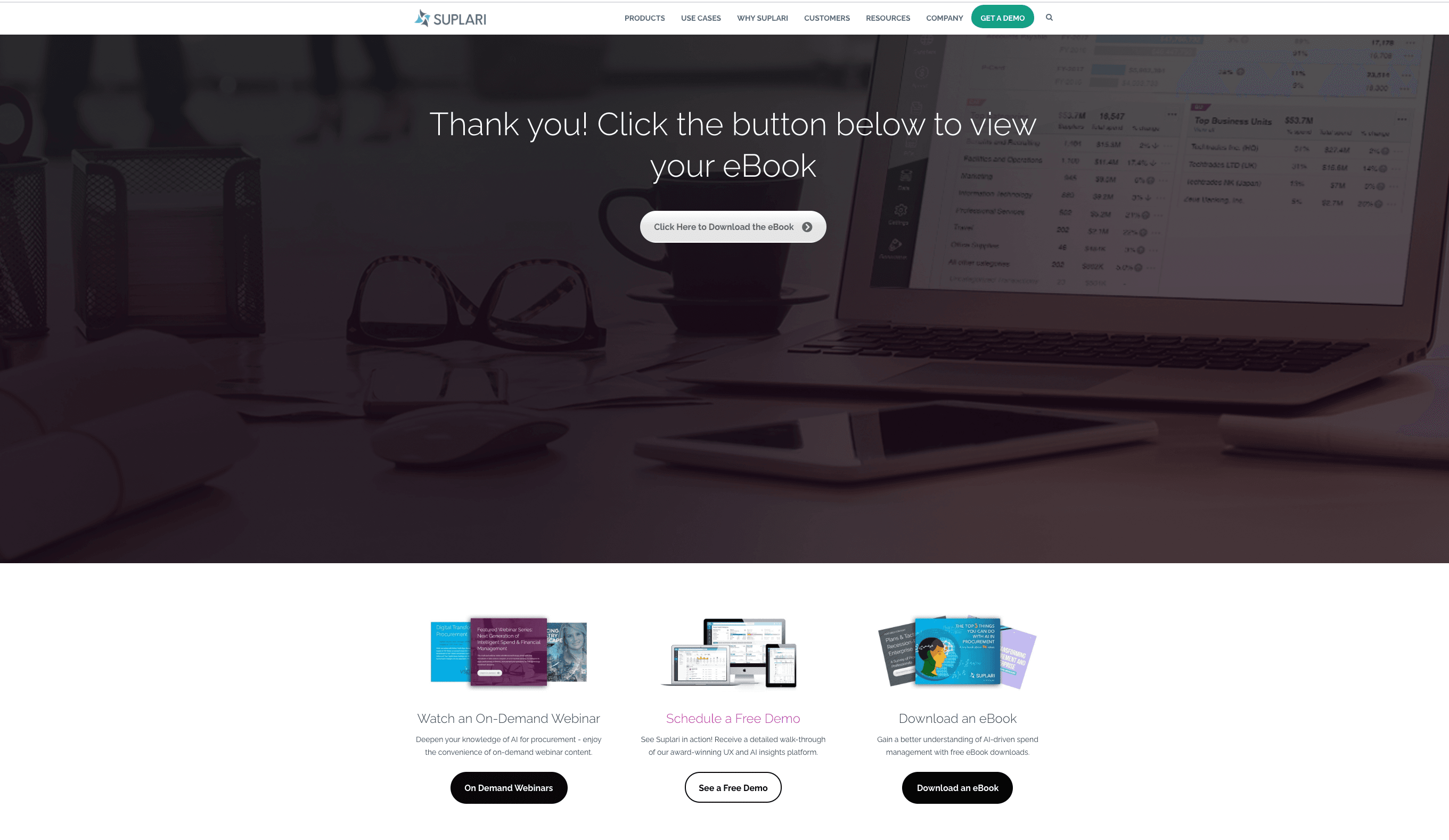
The next company on our thank you page examples list is Suplari, a startup that uses AI to help companies understand and get a handle on their spending.
After successfully signing up for one of their free ebooks, the company directs subscribers to this thank you page with more detailed instructions on how to get their ebook copy.
But the best part of the page comes after the detailed instructions and the download button. They use the thank you page to invite subscribers to:
So that's three offers in one thank you page. It seems like they're taking full advantage of the thank you page.
Why not? Leads are already interacting with your brand and are interested in what you have to offer. This is the perfect opportunity to offer them something else for free, such as a free demo of your software and ultimately convince them to buy your main product.
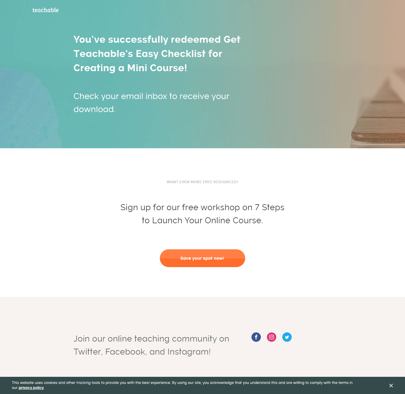
Teachable, a software that gives course creators a place to host their online courses, is another company that does a fine job with its thank you page.
Once someone signs up for the checklist, they're directed to this nicely designed thank you page you can see above.
But in addition to informing subscribers they should check their email, the company uses this opportunity to ask subscribers to sign up for a webinar. Presumably, the company will use the webinar as an opportunity to convince those watching to create an online course using their product.
Notice the call to action midway through the page in bright orange color. It's well-located and easily noticeable.
But why leave it to that when you can also use the opportunity to ask subscribers to join your online teaching community on Twitter, Facebook, and Instagram?
Adding social media buttons may seem like a small thing but it can get people to further engage with your brand, plus it gives you free promotion.
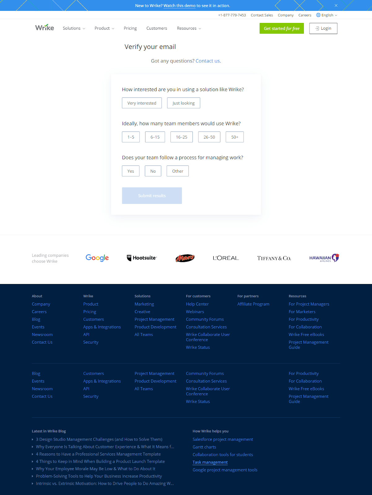
The next company that captured our attention with its well-crafted thank you page is Wrike, a project management software.
The company's lead magnet is a free trial of its software that takes subscribers to this thank you page where they are asked to fill out a quick survey.
Surveys, such as the one in our example, are an effective way to examine how serious your leads are in using your service/product. What's more, your support team will get more detailed information on who your leads are and use that data when they follow up.
And it doesn't have to be a long-format survey as extensive surveys tend to bore the person. Instead, use a short survey just like Wrike did that is only 3 simple questions long. Make sure the questions are on-point and get your sales team some valuable information.
The marketing team at Wrike used the opportunity to add another vital element to the thank you page, which is social proof. If you look below the survey, you'll probably notice the logos of some of the brands that use Wrike as their project management software, such as Google, L’Oreal and Tiffany. By displaying the client logos, Wrike is actually telling leads that if their product is good enough for a brand like Google, it should be good enough for anyone.
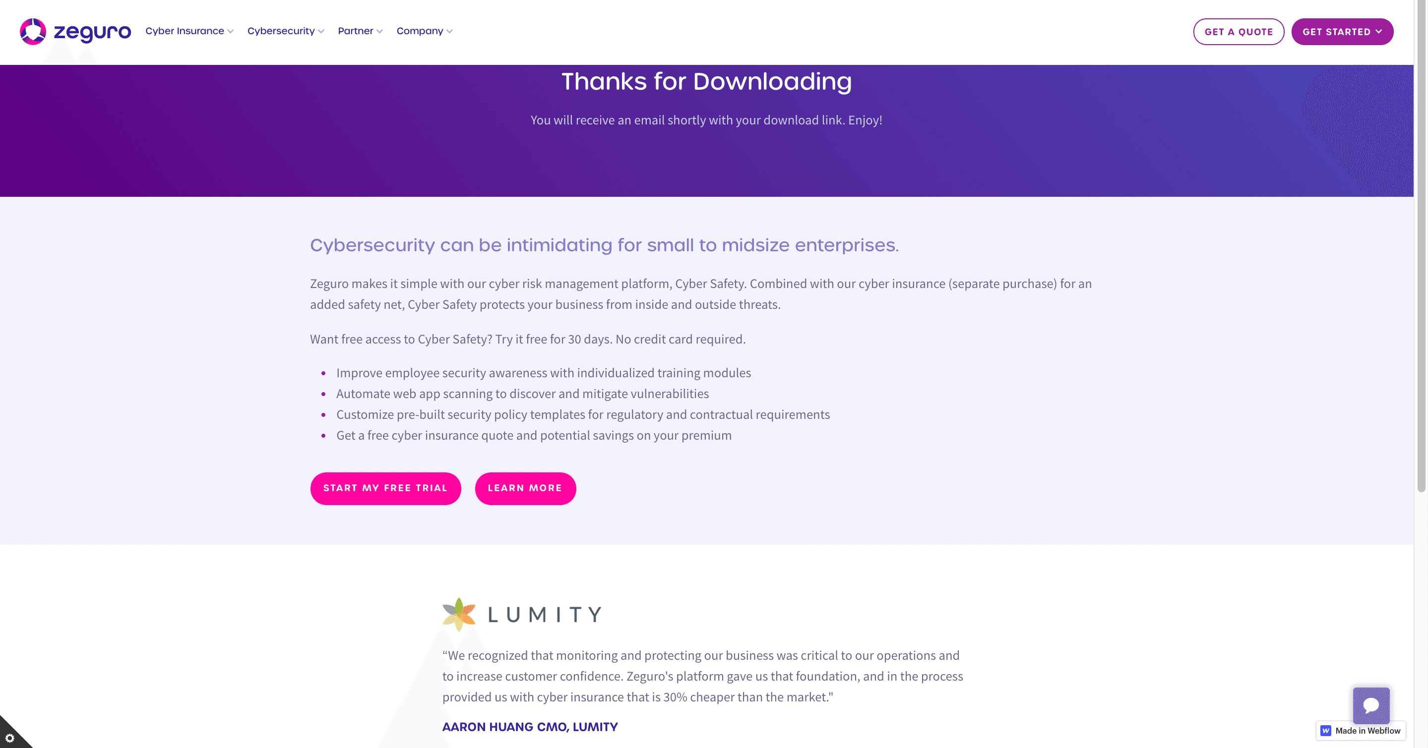
Thank you pages are a goldmine for conversion opportunities and no one understands that better than Zeguro. For those of you who don't know, Zeguro is an online insurance platform that helps small and medium businesses mitigate risk and loss.
Like many other companies, this insurance company uses free ebooks as a lead magnet to motivate visitors to fill out a form.
After submitting their information, subscribers are directed to this thank you page (example above), where they're thanked for downloading the content.
What follows the thank you note is a well-written value proposition that sells the company to the ones reading. In short, Zeguro convinces subscribers that Cyber Safety will protect their business from inside and outside threats.
A large CTA button in neon pink is easily visible and entices subscribers to sign up for a free trial with no credit card involved. There's an alternative CTA button that leads subscribers to a different page where they can learn in more detail how Zeguro can protect their business.
The cherry on top is the social proof on the bottom of the page that comes in the form of a client testimonial.
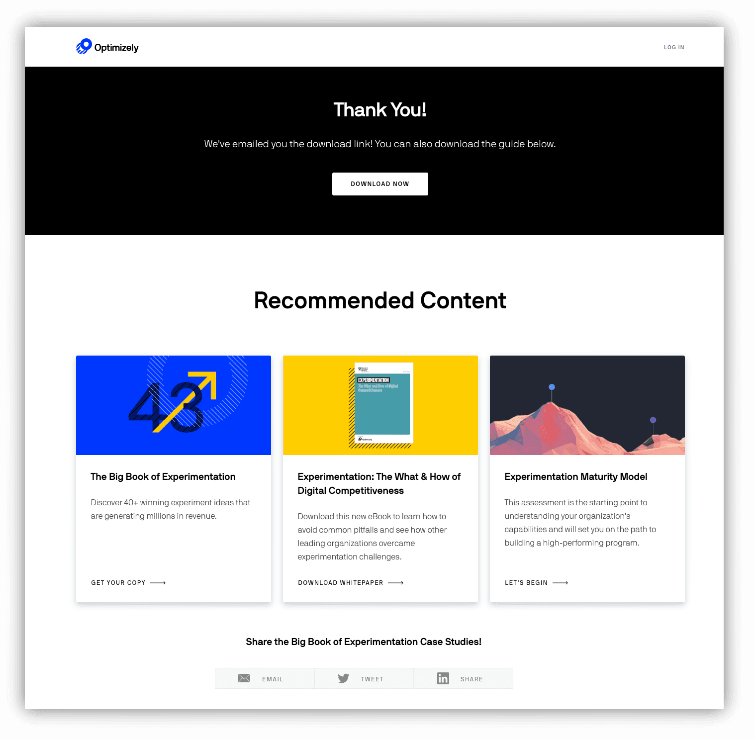
The last example on our thank you page examples list comes from a digital experience platform that you may or may not have heard of, Optimizely.
When a prospect downloads one of their PDF guides, Optimizely sends subscribers to a thank you page that includes a download button so that they can access the file directly from the page (their guide is also sent to their email).
Below the DOWNLOAD NOW button, a Recommended Content shows subscribers related content that they may be interested in reading. This is a great strategy for keeping people engaged and nurturing them further along in the sales funnel.
At the button of the page, there are social media buttons if subscribers are interested in sharing the content they're downloading.
Nicely played, Optimizely!
Having a thank you page that entices leads to perform more desired actions on your site is like saying, "Would you like fries with that?"
It's a simple proposition that has earned fast-food restaurants around the world millions of extra dollars and can do the same for your business, too.
By motivating people to sign up for a free trial or download your app, you're positioning your company to maximize conversions and ultimately generate more sales. With that said, if you're looking for ways to optimize your conversion rate, thank you pages are one component that you shouldn't overlook.
To sum up:
GrowSurf is modern referral program software that helps product and marketing teams launch an in-product customer referral program in days, not weeks. Start your free trial today.
You have visitors, but those visitors aren't converting to paid customers. Here are 11 cool ways to increase conversion rates on your site.
High-converting landing pages are the holy grail of any digital business. Here's how you can design landing pages that bring in conversions.
Referrals marketing works because it's based on human psychology. Customer referrals will still be effective 100 years from now and here's exactly why.