Put your growth on autopilot
GrowSurf is modern referral program software that helps product and marketing teams launch an in-product customer referral program in days, not weeks. Start your free trial today.
Summarize with AI
Your landing page will often serve as the face of your brand. Landing pages introduce your site visitors to the products and services that you're offering, so it’s important to design them with conversions in mind.
That said, one of the best ways to get the most of your landing pages is to explain what problems you can solve. That way, you can compel your site visitors to take action.
In a nutshell, a landing is a standalone page that's tailored to generate high-quality leads.
To drive conversions, your landing page needs a clear and compelling call-to-action (CTA) that guides visitors toward the desired action, whether that's filling out a form, signing up for a free trial, making a purchase, or otherwise engaging with your offer. The most effective landing pages remove navigation and distracting links, using persuasive copy, benefit-oriented messaging, and trust signals like testimonials to laser-focus visitors on converting.
Marketers will often drive warm leads to a landing page through paid advertising, email marketing, or other promotional channels. Warm leads are prospects who have shown interest but need that final nudge to convert. An effective landing page addresses their key objections and desire for more information through persuasive copy, visuals, social proof, and a compelling call-to-action.
Users might also arrive at your landing page from PPC advertising, social media promotions, email marketing campaigns, or other digital channels. Conversion rates can vary significantly based on factors like industry, traffic source, and the complexity of the desired action. For example, a simple lead generation offer like an ebook download may see higher conversions than a high-consideration B2B purchase. Regardless, optimizing your landing page for conversion is crucial to maximizing ROI from your marketing spend.
In this post, we'll walk you through practical ways on how you can design a high-converting landing page.

Your headline is the first thing visitors see when landing on your page, so it needs to instantly convey the core value proposition and what's in it for them. According to data from HubSpot, around 70% of visitors will bounce if your headline doesn't hook them within a few seconds.
To maximize engagement and conversions, craft a clear, persuasive headline that highlights the key benefits of your offer using language that resonates with your target audience. Make it about them, not about you or your product's features.
The headline is the first opportunity to capture attention and communicate your unique value proposition. Use clear, persuasive language that directly addresses your audience's pain points and desires. Highlight the key benefits they'll receive by engaging with your offer, not just surface-level features.
Visuals like hero images, product photos, and videos play a crucial role in capturing attention and helping visitors understand your offer. Choose visuals that are relevant, high-quality, and emotionally compelling. Videos in particular can increase conversions by up to 80% by demonstrating your product or service in action.
The hero image or video at the top of your landing page should instantly communicate what you're offering and why it matters. Evoke desire by showing the benefits and outcomes your customers can achieve.
Your hero visual shouldn't just be a stock photo - it needs to actively showcase your offer's core value proposition and key benefits. Use images or videos that tell a compelling story and evoke the desired emotions in your audience. According to research, emotional marketing campaigns are more memorable and impactful for building brand affinity.
The hero visual should take center stage on your landing page, instantly grabbing attention and making visitors say "I want that!" Whether through aspirational lifestyle visuals or product demos, your visuals need to make it easy for people to visualize the transformation your offer can deliver.
Use a mix of visuals throughout your landing page to reinforce your core message and value proposition. In addition to the hero visual, incorporate supporting images, graphics, charts, and videos that help convey key benefits and use cases. However, be intentional with your visuals - avoid clutter by only including assets that directly support your marketing goals.
While your headline and visuals may grab initial attention, your body copy is what will convince visitors to take action. Go beyond just listing features - focus on communicating the key benefits and real-world value your offer delivers.
Use an engaging, conversational tone that connects with your audience's desires and pain points. Highlight how your product or service can improve their lives or solve their problems. Back up claims with social proof like customer testimonials and data.
Aim for clear, concise, and compelling copy that guides visitors toward your desired conversion goal. Use a conversational, second-person tone with words like "you" and "your" to forge a personal connection. Speak directly to your audience's needs and desires.
Break up text with bullet points, subheadings, and short paragraphs to improve scannability. And back up key claims and benefits with social proof like customer quotes, data, and credentials to build trust.
Effective landing page copy should read like a natural conversation tailored to your audience. Use simple language, address their questions and objections, and guide them logically toward taking your desired action.
Copywriting means having a conversation with your reader on the page.
— Chris Tweten 🍁 (@ctwtn) July 8, 2021
🧵 How to Write Conversational Copy
Your call-to-action (CTA) is the entire reason for your landing page's existence - it's what prompts visitors to take your desired conversion action. As such, it needs to be highly visible and clearly communicate what will happen when clicked.
Use contrasting colors, directional cues, whitespace, and actionable language to make your CTA button or link impossible to miss. Describe the action clearly and highlight the value, like "Download My Free Ebook" rather than just "Submit."
Ideally, your CTA copy should highlight the key benefits and value proposition behind taking action. For example, "Get My Free Course" is more compelling than a vague "Submit" button. Use active language focused on what's in it for the visitor.
From a design perspective, make your CTA a visually prominent button or link using contrasting colors that grab attention. Avoid blending it into the page design. You can also use directional cues like arrows or eye gaze to further emphasize the CTA.
For maximum visibility and conversions, your primary CTA should be prominently placed "above the fold" - the portion of the page visible without scrolling. This ensures visitors see your offer and desired action immediately upon landing. Repeat secondary CTAs further down the page to catch anyone who continues reading.
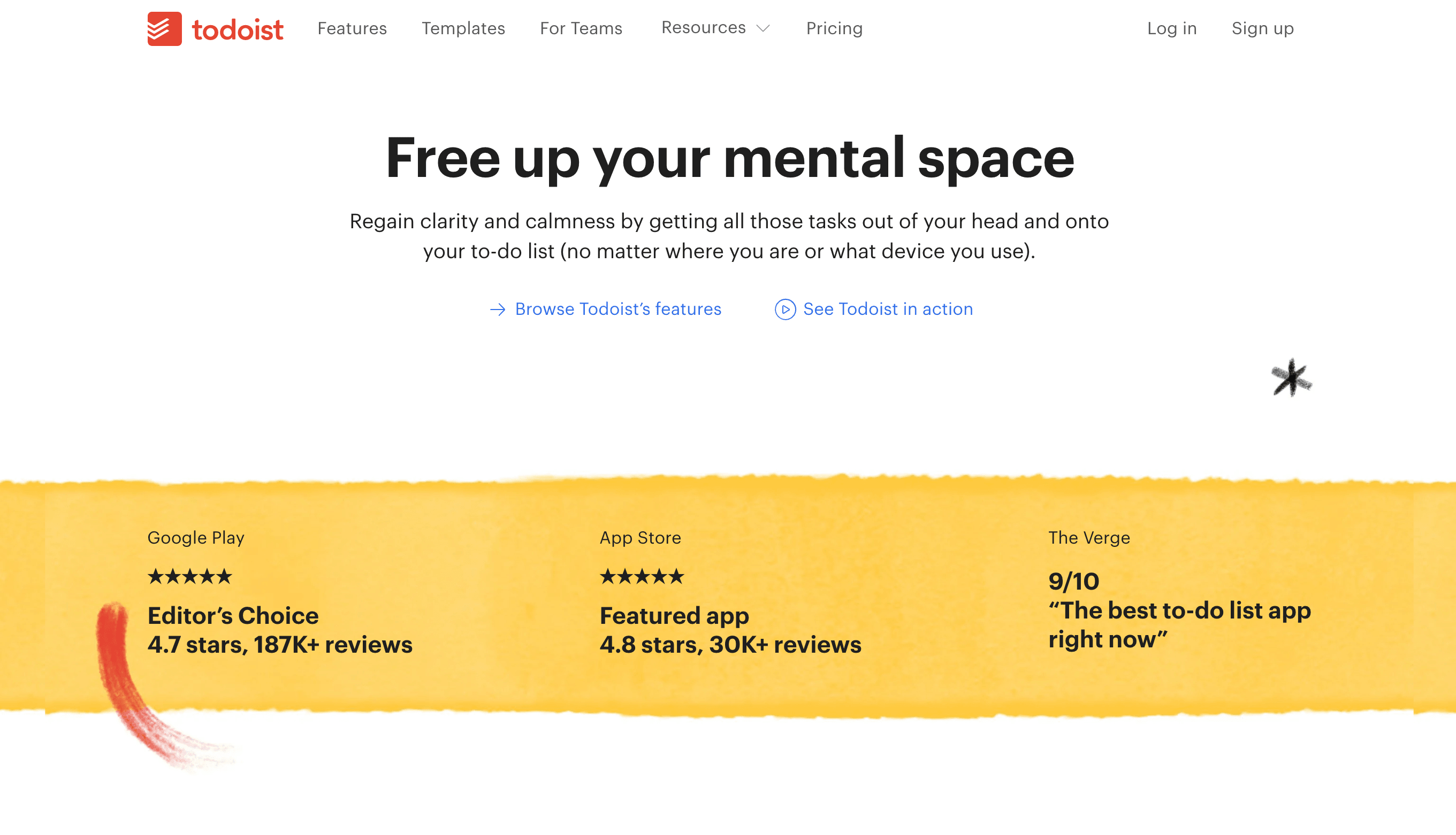
Use social proof like customer testimonials or data to showcase your product's popularity or success rates, and place logos of well-known brands you've worked with on your website. This can go a long way in building trust and credibility with landing page visitors.
If you have impressive metrics, customer stories, or other proof points that demonstrate your offer's value, highlight them prominently. This crucial trust-building step can overcome skepticism and motivate conversions from prospects who need that final nudge of confidence. Even prospective brand ambassadors will be more likely to realize that your referral rewards are more valuable by leveraging social proof.
Seeing evidence that your offer is popular and has helped others succeed makes prospective customers more likely to perceive it as valuable and low-risk. Whether through customer testimonials, data points, media mentions, or other forms of social proof, this credibility boost can be the tipping point for conversions.
For instance, if your landing page visitors see that thousands have already signed up previously, they're more likely to sign up as well.

Social proof leverages the wisdom of the crowd to influence behavior. Seeing that others have engaged with and benefited from your offer makes people more inclined to convert themselves.
Leverage this psychological principle by prominently showcasing your social proof throughout your landing page copy and design.
If your goal is lead generation, your form plays a critical role in converting landing page visitors into captured leads. The key is to strike the right balance between the information you want and minimizing friction in the conversion process.
Only ask for the essentials like name and email upfront when offering a free incentive like an ebook or newsletter subscription. As you move prospects further down the funnel toward higher-commitment offers, you can request more detailed information. But always prioritize a fast, seamless user experience.
For top-of-funnel offers like downloadable content, a name and email field may be all you need on your form to reduce abandonment. Pair this with a valuable, relevant incentive and you'll be able to capture leads without excessive friction. The more you can lower the barrier to conversion, the higher your form completion rates will be.
The core purpose of your landing page is to guide visitors toward a singular conversion goal. Anything that pulls their attention away works against this, including navigation menus and links to other websites or pages on your own site.
By removing these potential exit points, you keep visitors laser-focused on your marketing message and call-to-action. Only include links and elements that directly support the conversion journey you've mapped out.
With the majority of web traffic now coming from mobile devices, it's absolutely crucial that your landing pages are optimized for small screens. This goes beyond just responsive design - you need to rethink the entire user experience for the mobile context.
Use a mobile-first approach focused on fast load times, easy readability with proper text sizing and spacing, and intuitive navigation designed for tap inputs. Pay special attention to your mobile form and CTA to ensure they render and function flawlessly.
After a visitor completes your desired conversion action like joining your email list or making a purchase, provide a dedicated confirmation page. This "thank you" page serves two key purposes:
Don't just send them back to your homepage. Map out a seamless post-conversion experience that continues building engagement and moving them along your marketing funnel.
Designing landing pages that convert isn't just about cramming in as much information as possible. It's about strategically guiding visitors through a seamless marketing funnel tailored to their needs and motivations.
Focus on clearly articulating your unique value proposition through compelling copy and visuals that speak to your audience's pain points and desires. Build trust with social proof and credibility indicators. Optimize your calls-to-action and lead forms for maximum conversions. And map out a post-conversion experience that continues nurturing prospects.
By following landing page best practices around persuasive design, frictionless user experiences, and benefit-driven messaging, you can craft high-converting pages that deliver maximum ROI for your business.
GrowSurf is modern referral program software that helps product and marketing teams launch an in-product customer referral program in days, not weeks. Start your free trial today.
Lead generation for B2B companies can be hard, but investing time into building powerful B2B lead magnets can make it a breeze. Here's how to make lead magnets.
SaaS referral programs are one of the most cost-efficient ways for startups to gain new signups and paying customers. Here's 5 reasons why and examples to study
The easiest way to make a product go viral? Build it with a viral design. Learn the 6 best ways to incorporate virality into product design.